


CHALLENGE
In 2002, Banco Caracas acquired a foreign bank in Colombia named Banco Tequendama and created a new financial institution focused on supporting export and foreign trade operations and meeting trade needs between Venezuela and the Andean Region.
Banco Caracas needed to have leverage in its new market and promote its competitive edge with a strong, global, energetic image that would integrate brand elements of the acquired organization. Banco Caracas also needed to expand its services to offer competitive retail operations nationwide.
INSPIRATION
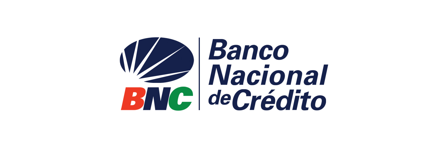
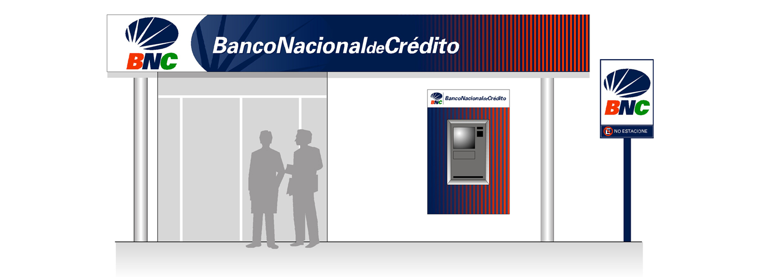
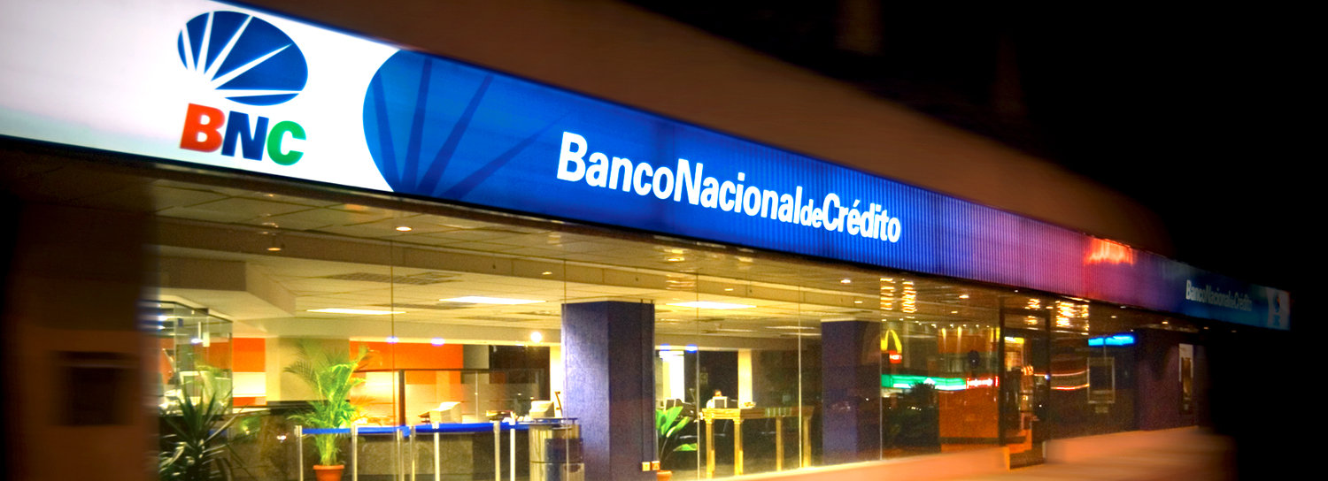
Inspired by the optimism and energy of a sunrise, Neri Design Group (NDG) used this image to illustrate the new horizons that were about to open up to the financial institution.
SOLUTION
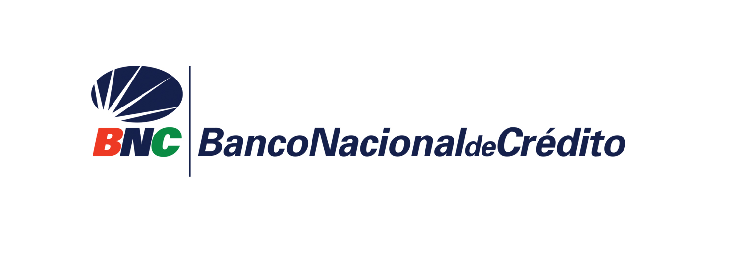
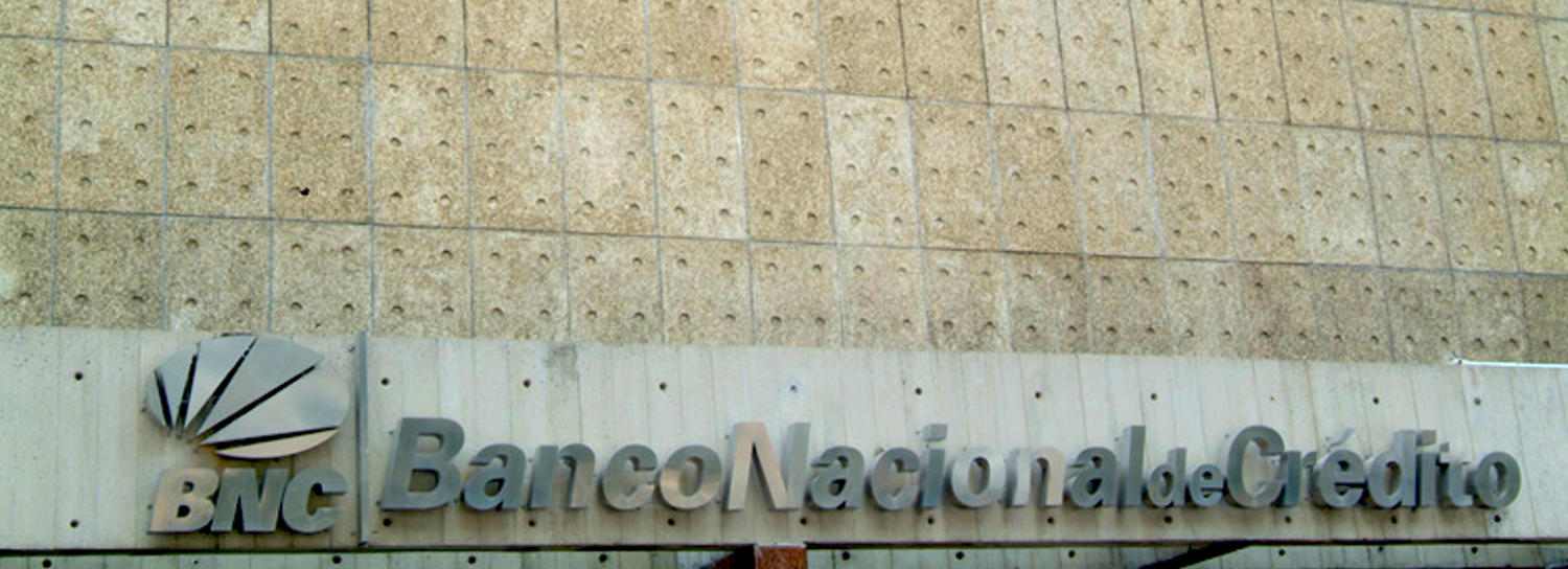
The new bank was called Banco Nacional de Crédito (BNC), a title validated by NDG who worked closely on the naming project.
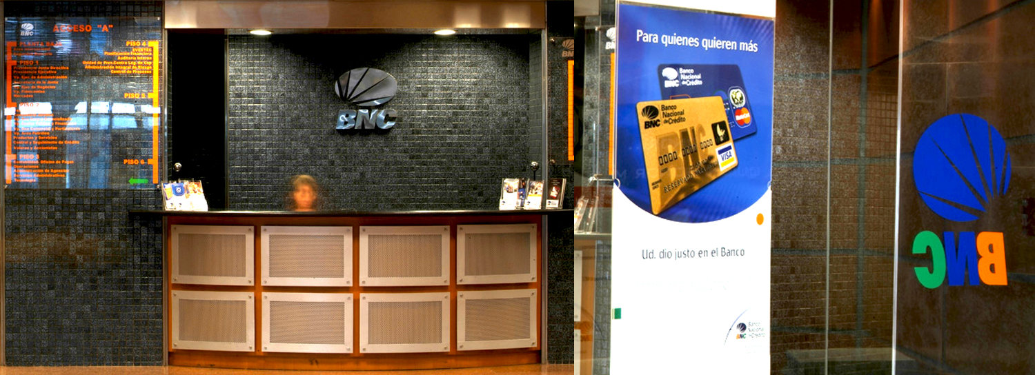
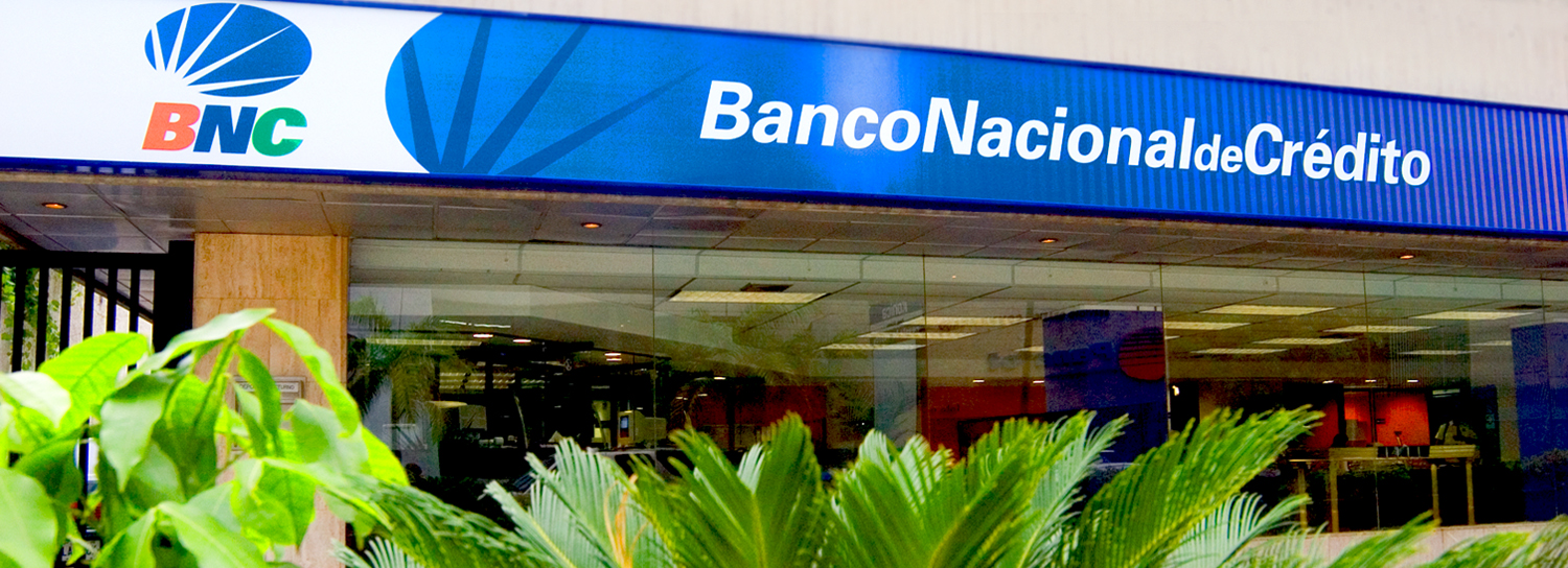
In terms of a new brand image, the solution was to depict a sunrise and boldly integrate the different brand colors of both companies into the new graphic. The colors used in the Banco Caracas logo were used, making BNC aligned with Banco Caracas in the market. At the same time, NDG kept the green from the Banco Tequendama logo to represent growth within a new organization and innovation.
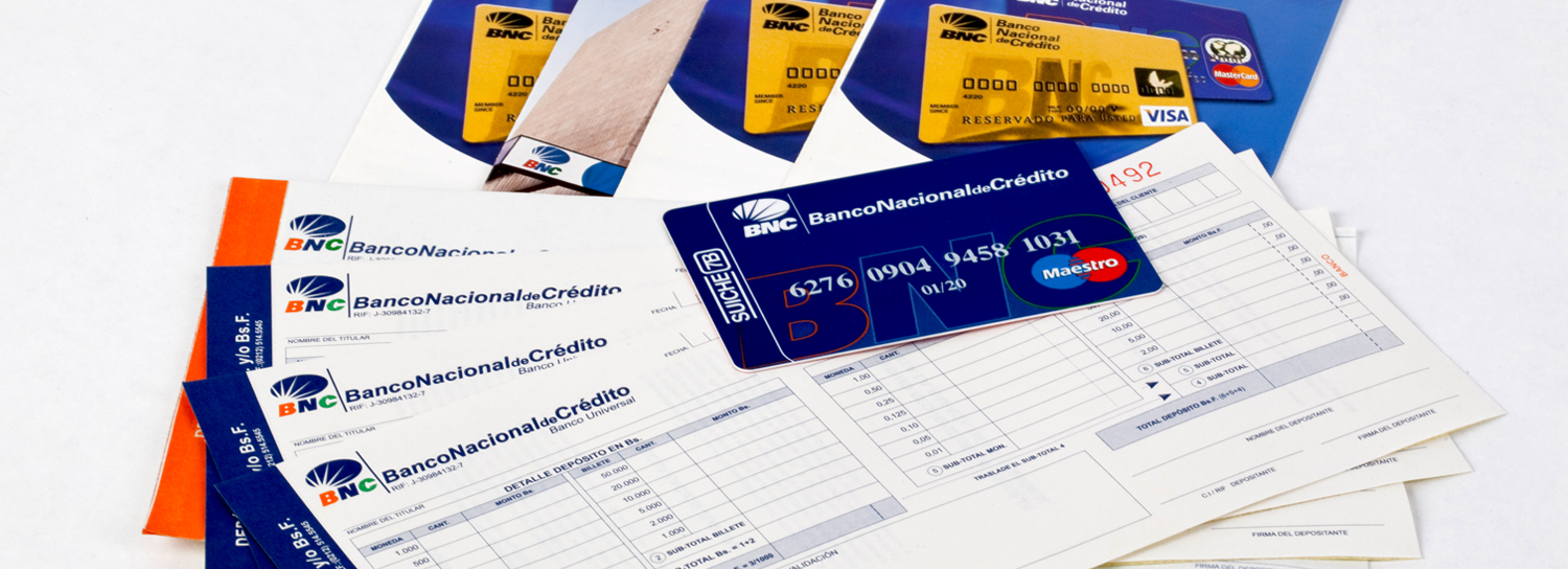
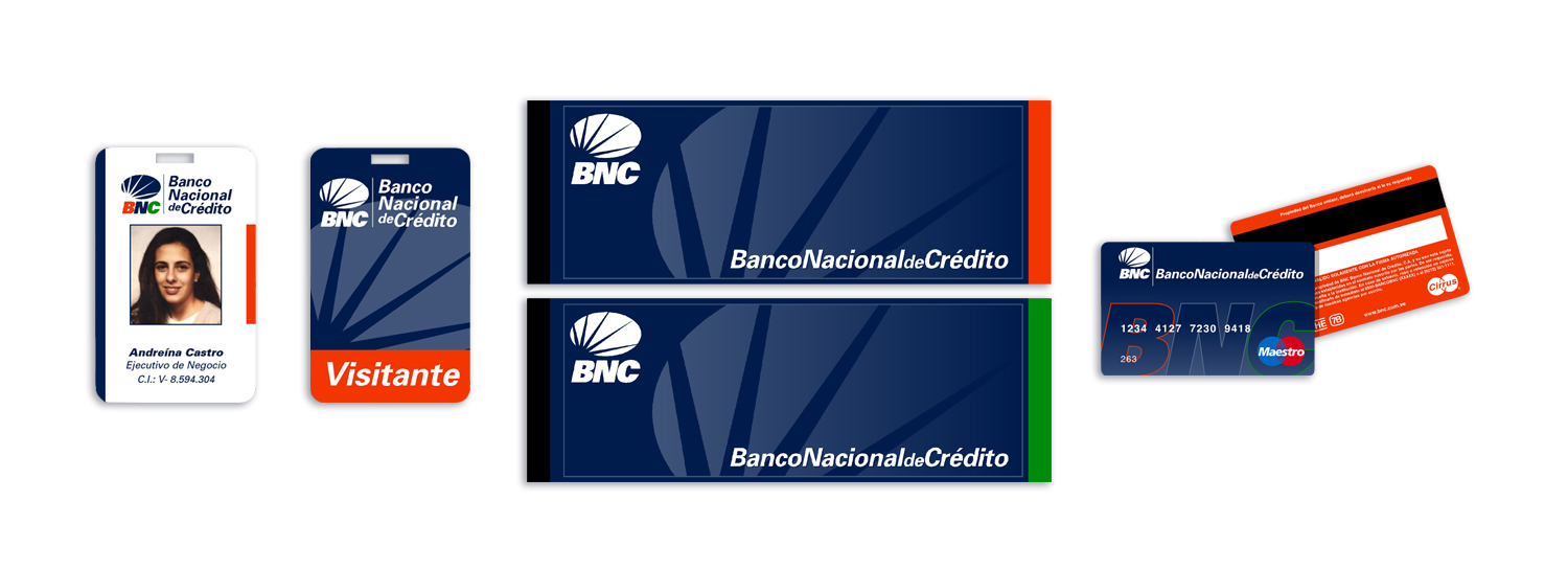
This style was carried throughout all of BNC’s banking communications, including its products and different instruments. Ultimately, NDG followed the same guidelines that were used for Banco Caracas, emphasizing both tradition and innovating services.
RESULT
With its new image, Banco Nacional de Crédito grew into a strong, consolidated financial institution with the power and clout to acquire Stanford Bank Venezuela in 2009. They began with six branches and today have 165. Moreover, the business is extending into new territory, offering services and accounts to millions of clients in other countries offshore including Puerto Rico.


