


CHALLENGE
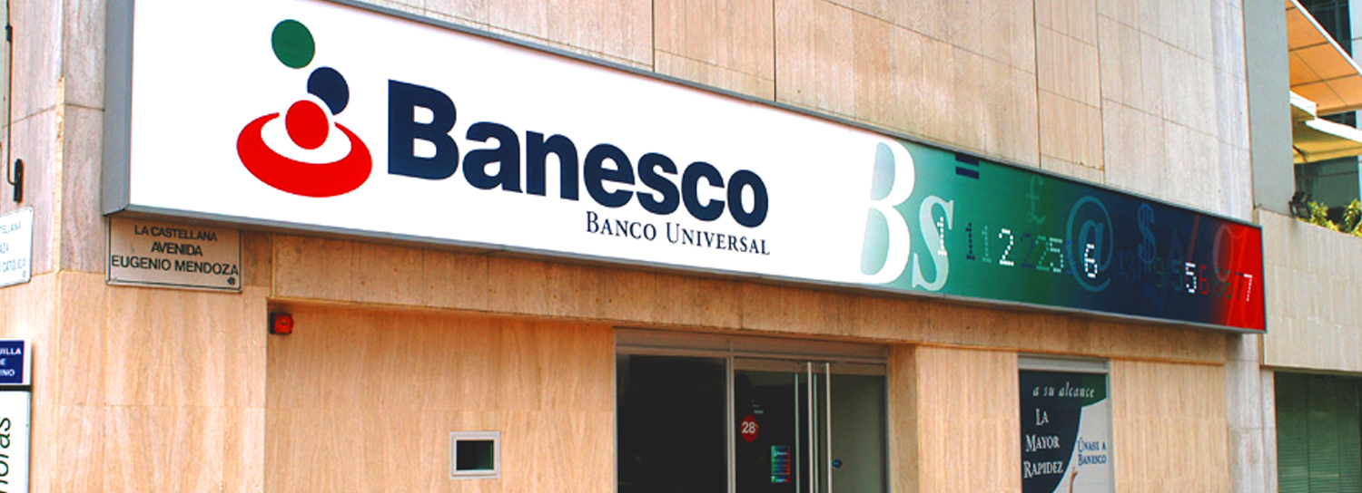
In 1992, a visionary businessman from Venezuela created a sleek and modern bank that was rooted in financial innovation and superior service. Banesco asked Neri Design Group (NDG) to help them revolutionize the banking industry in Venezuela and express its vision through breakthrough design.
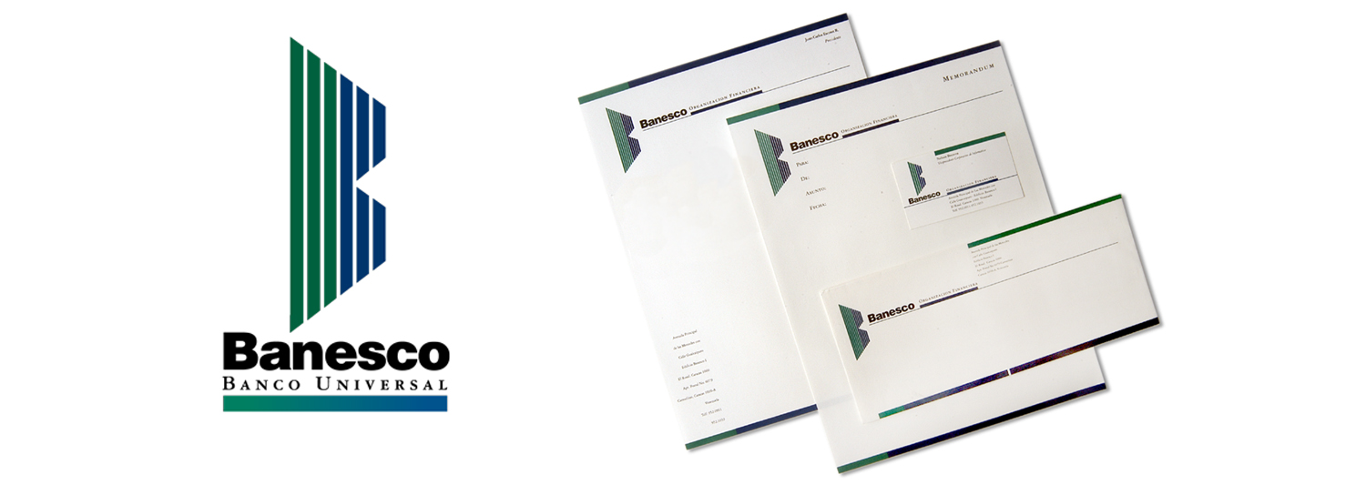
Banesco was also overseeing an exciting merger in 2001. Two major Venezuelan financial institutions – Banco Union, an older, long-standing banking organization, and Caja Familia, Venezuela's largest savings and loan institution – were joining forces. Banesco asked Neri Design Group to create an image for Unibanca, the new entity.
By 2002, Banesco and Unibanca, both of which had implemented corporate images conceived and created by NDG, merged into Banesco. In the new partnership, the client wanted to see a bank rooted in innovation, expansion and common sense.
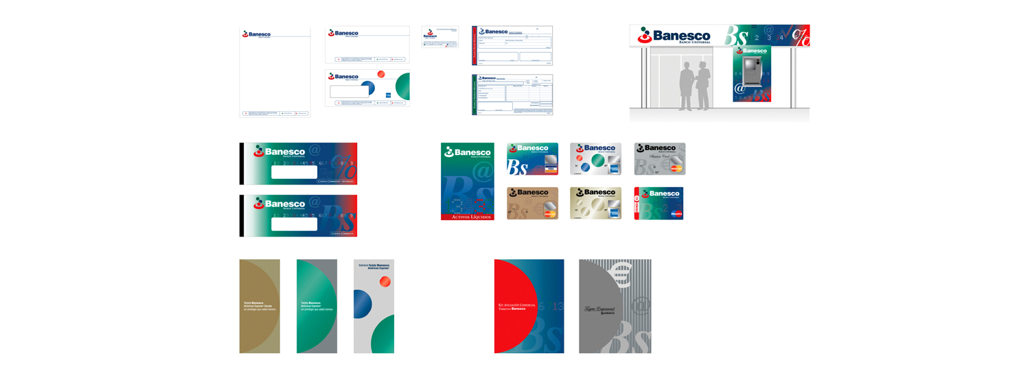
Then in 2013, Banesco reached a milestone in the banking sector in Venezuela , earning a number one ranking and cementing its place as a solid financial institution. Banesco was now represented in six different countries, and the company had bought three financial institutions in Spain. However, due to fast expansion, Banesco was showing inconsistencies in its brand image. For its fourth project with the bank, NDG was tasked with recovering the brand’s essence, building brand consistency throughout all its touch points, and taking it into the new century. NDG had to bring the brand into the emerging digital era while bringing a personalized touch to educating consumers about Banesco.
INSPIRATION
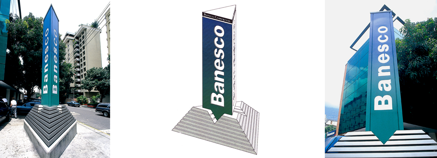
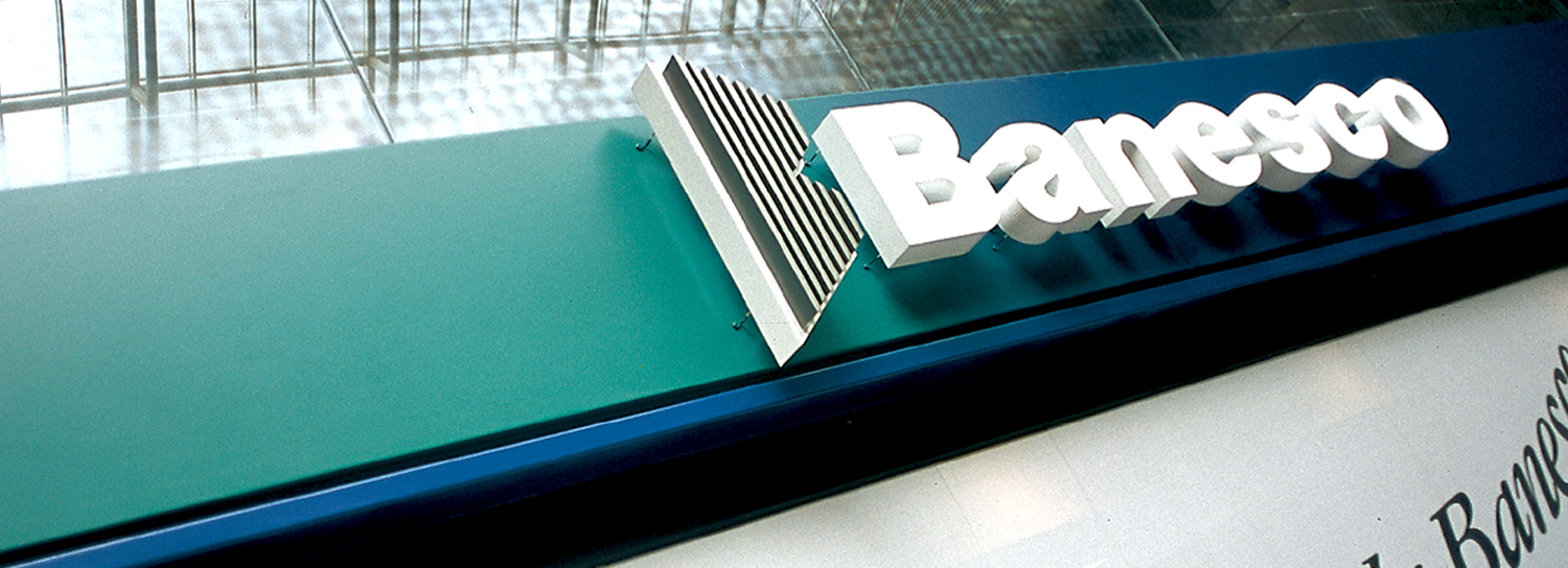
Our first inspiration came from a gold bullion which exemplifies strength. To represent innovation and consistent growth, we took elements from kinetic art to portray movement and incorporated a field landscape to represent Banesco’s worldwide expansion and constant aim to reach for the stars.
SOLUTION
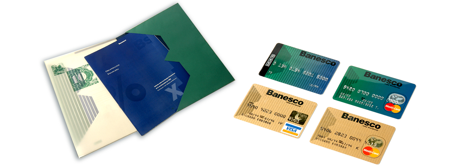
In a 2002 comparison of the two brands, research showed that the Banesco name was more recognized as an elite banking organization but that a large population also considered the Unibanca symbol to be dynamic, accessible, and positive. NDG combined the two images, retaining the heritage of their dual ancestry but projecting a new, progressive, and innovative organization.
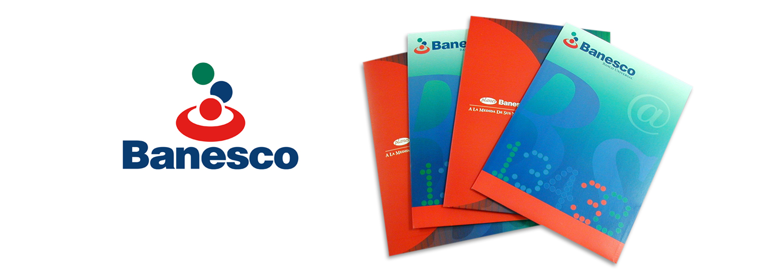
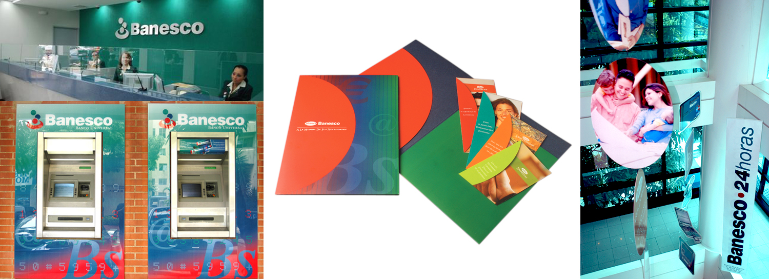
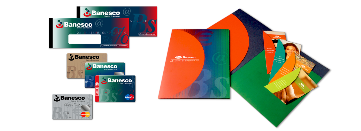
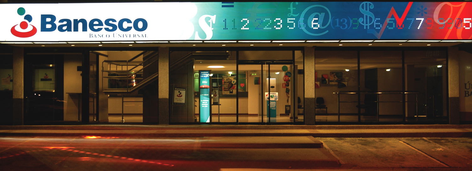
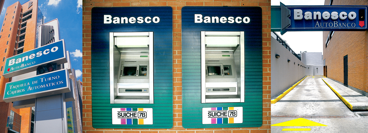
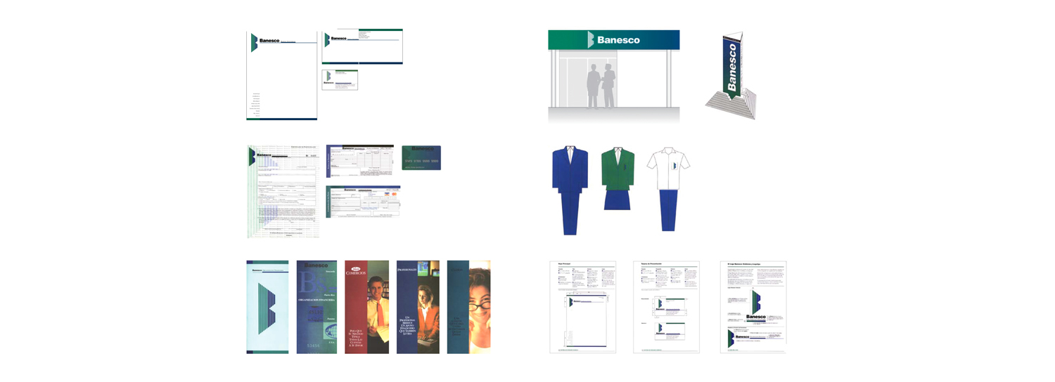
The gold bullion that served as early inspiration was segmented into eight pieces to represent the core values of Banesco. This design was then carried throughout all elements of the newly merged bank, including environmental design, signage, annual reports, credit cards, forms, individual product brochures, and many other related projects.
In 2014, NDG reviewed Banesco’s corporate image with the goal of maintaining its original essence but also reflecting its global position and high-quality standards. After this collaboration, Banesco was ready to engage an international audience.
RESULT
The initial merger garnered attention quickly within Venezuela. Banesco both retained existing customers and attracted new ones, thus increasing overall market share. Banesco was the third largest bank, measured by total assets.
By recovering Banesco’s brand essence and creating clear guidelines for aligning all of its brand elements, NDG prepared the company for international expansion.
Since 2001, Banesco has entered new markets in Latin America, North America and most recently, Europe, all while projecting a strong and solid corporate image that makes the company a competitive player in the international financial market.


