
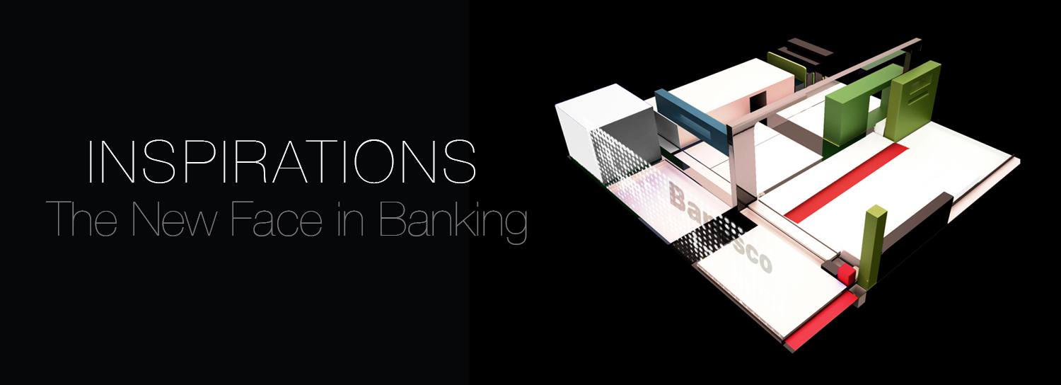


CHALLENGE
In 2013, Banesco reached a milestone in the banking sector in Venezuela: it was celebrating its 21st anniversary and earned the number one ranking for bank market share and total deposits.
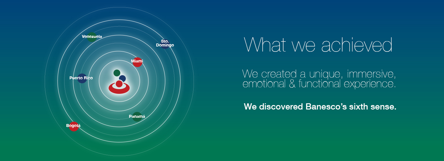
Also, Banesco was now represented in six different countries, including three recently acquired large financial institutions in Spain. Banesco had now cemented its place as a leading financial institution with a global footprint. However, due to rapid expansion through both organic and M&A growth, Banesco was showing inconsistencies in its brand identity and image across its properties. In order to address these issues, for the fourth time, NDG was selected as the Brand & Design Agency in charge of recovering the brand’s core essence: Financial Innovation. The mission was to refresh the core identity and provide consistency throughout all of its consumer touch points, enabling it to take full advantage of its new global presence and project itself as a leader and innovator in the global financial services industry.
NDG was tasked to create a world class customer experience for all of the Banesco agencies worldwide and to refresh the brand image to communicate and project a state of the art global financial services organization providing leading edge digital and traditional banking practices and product offerings.
INSPIRATION
NDG wanted to awaken consumers’ senses and provide a completely new experience. NDG focused on upgrading the brand to reflect the broad concepts of evolution, innovation and globalization, while maintaining and recovering many of Banesco’s timeless elements and core attributes, which were unique to the brand for the past 21 years:
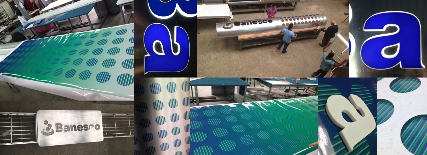
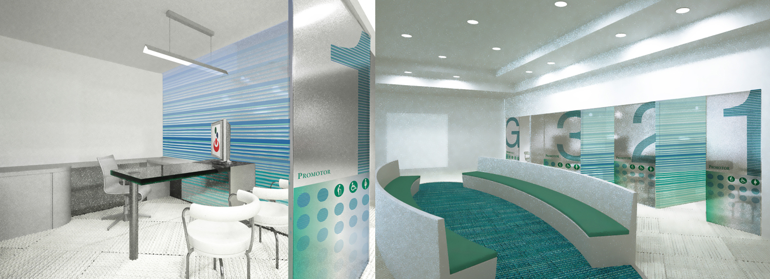
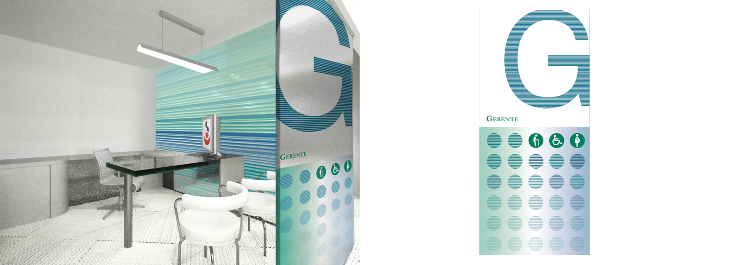
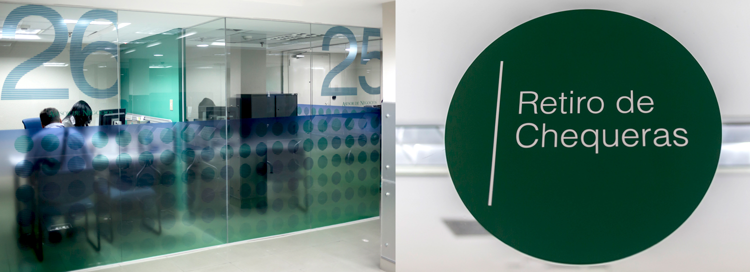
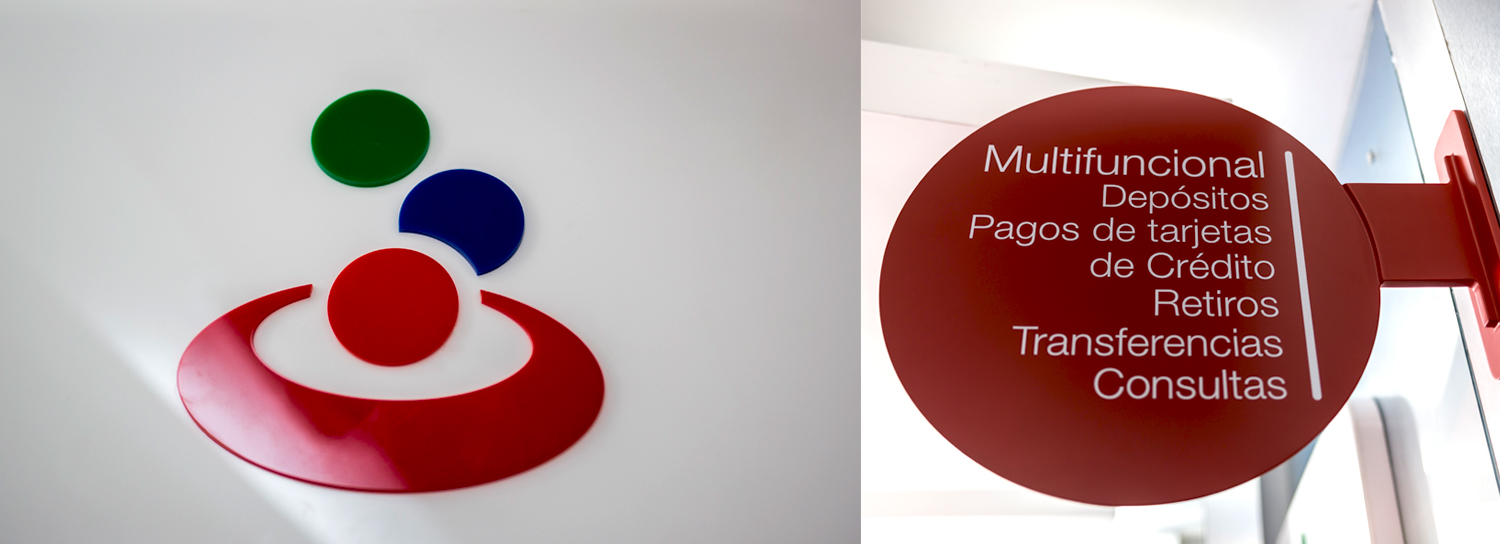
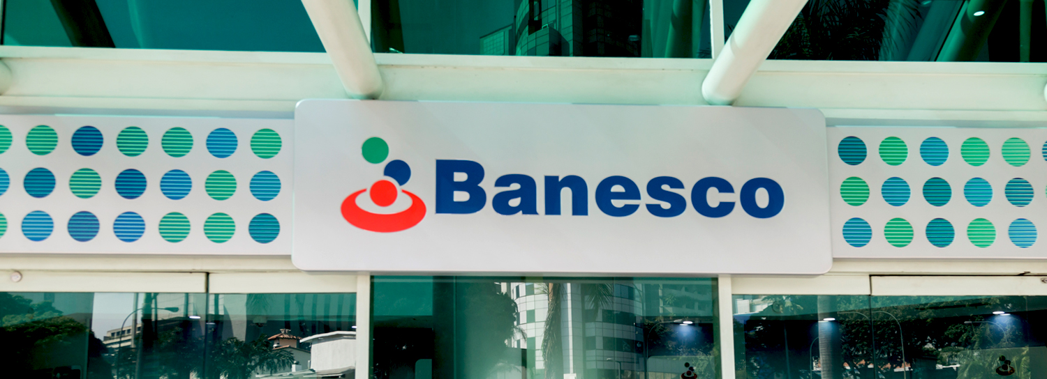
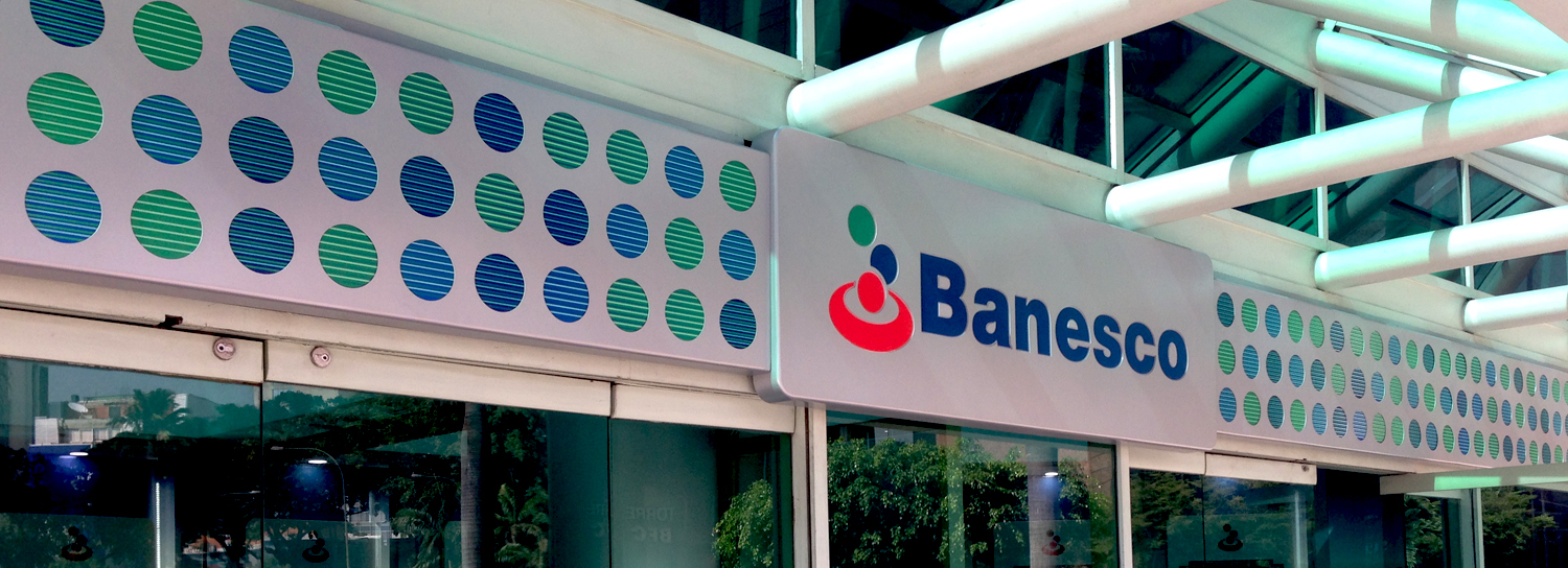
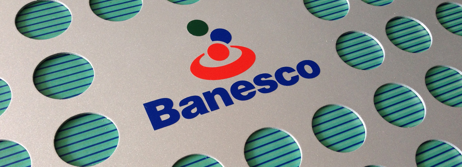
• Color: Green and blue, Banesco’s characteristic colors since 1992, returned as a symbol of innovation in a traditional and conservative setting. The use of the green to blue gradient represents Banesco’s alma mater as land and sky merge into a horizon of balance and harmony and create a sense of infinity. Red represents Banesco’s emotional side: the warmth, passion, vitality and action, applied subliminally to convey the brand’s heart and humanity.
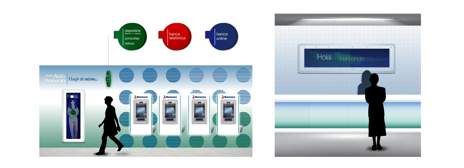
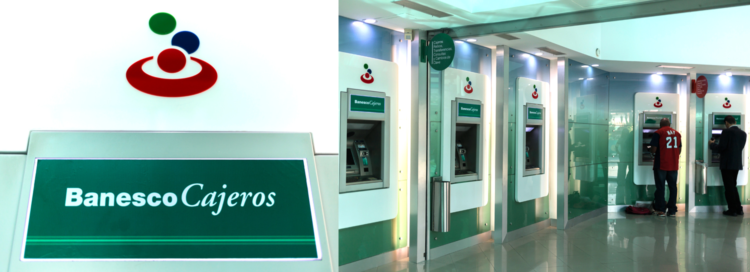
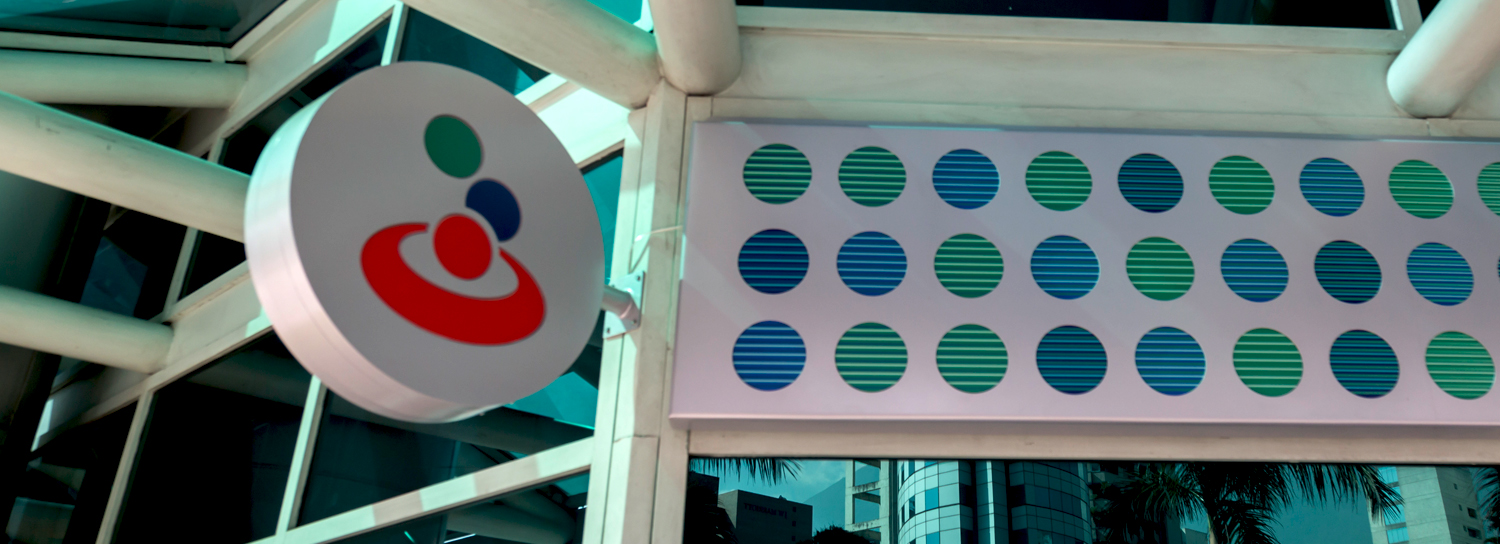
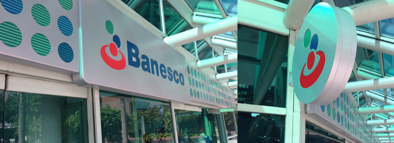
• The Circle: Symbol of the energy of unity, inclusion and equity representing perfection, eternity, evolution and movement of the brand.
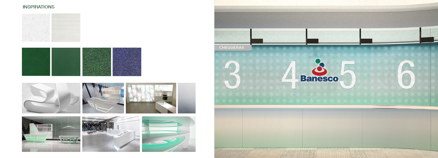
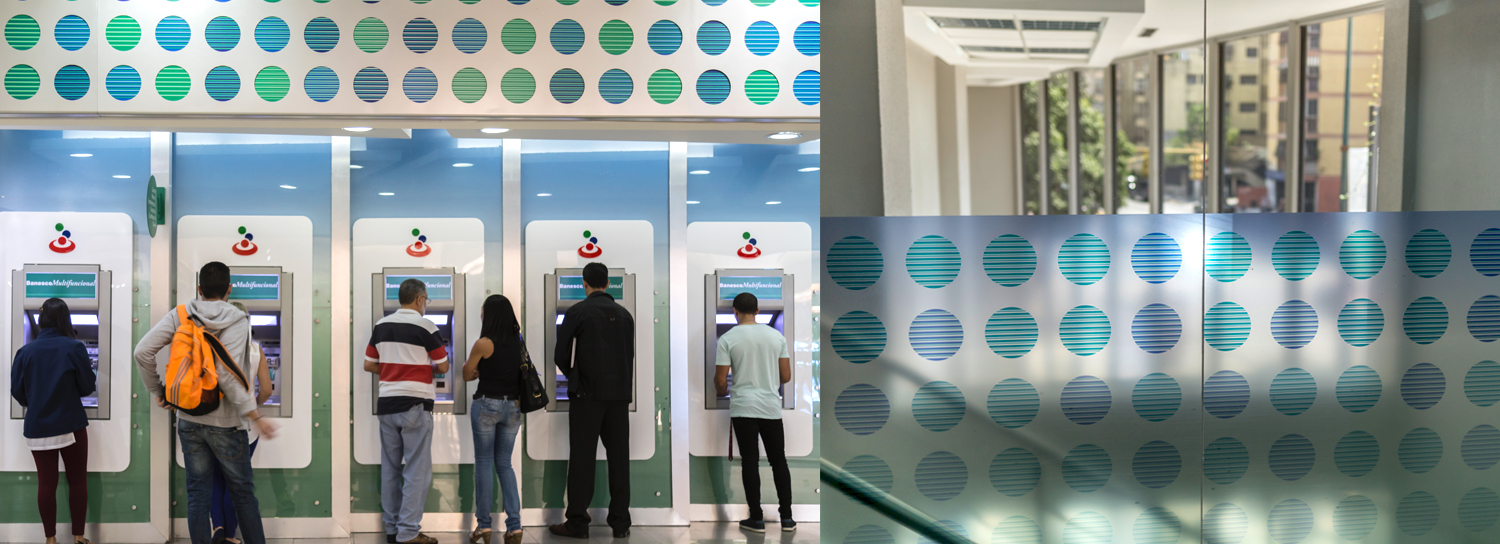
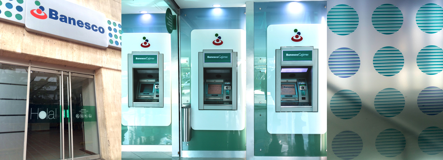
• Pattern: NDG originally designed this pattern in the 2002 chapter of work with Banesco to be used in the annual report after their merger with Unibanca – a key milestone for the bank. It consisted of composite-based circular shapes and lines of color, inspired by kinetic art, providing rhythm, multiplicity, movement and continuity to the whole creating a dynamic visual experience. NDG named this pattern “Abundance.”
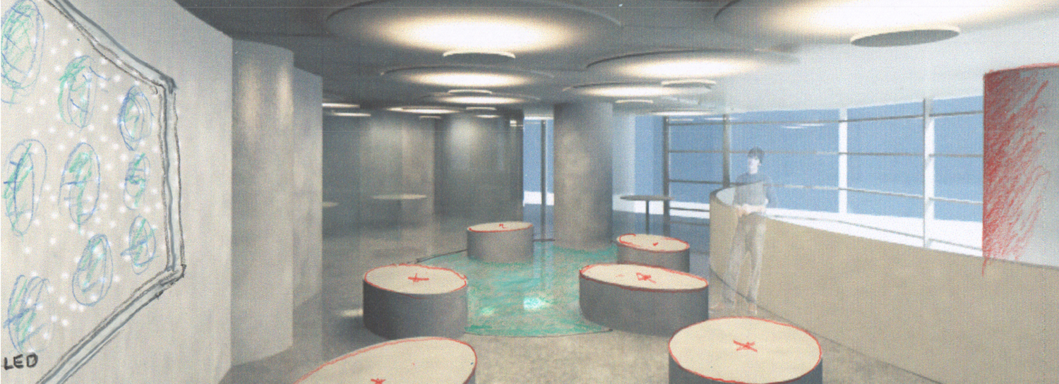
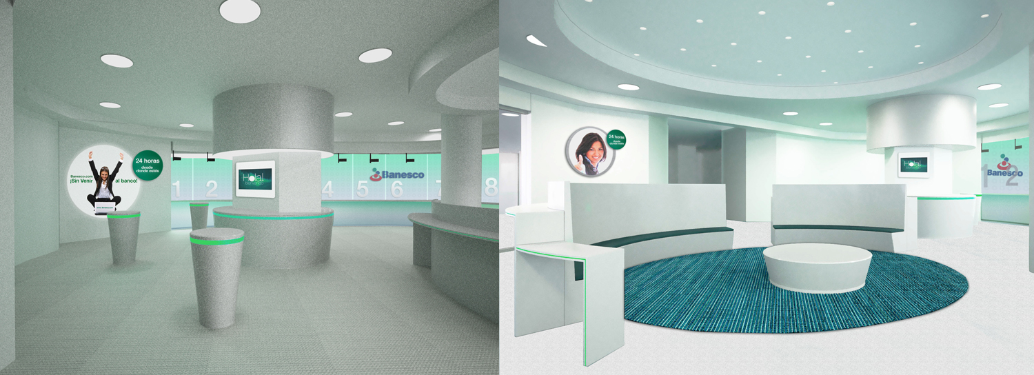
• Light: The lighting designed for the spaces was meant to create a pleasant and inviting sensation for anyone who walked into the Banesco agencies.
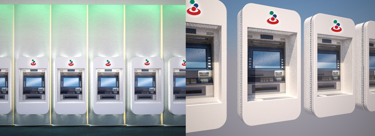
• Materials: As Brand Weavers, NDG wanted to be dynamic and playfully experiment with layers to showcase Banesco’s transition and growth. Metal was chosen as the main material representing the brand’s solidity and power. The die-cut circles on the metal functioned as windows into Banesco’s Abundance pattern.
SOLUTION
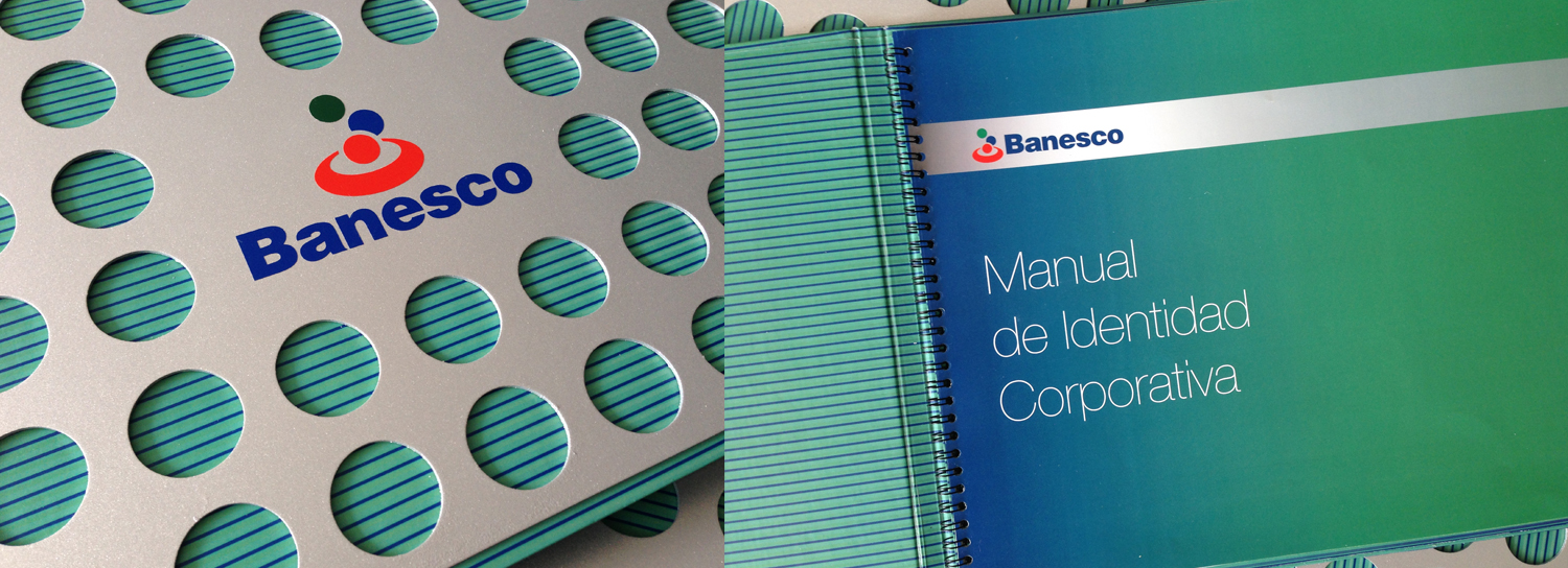
NDG reviewed Banesco’s corporate image with the goal of maintaining its original essence and high-quality standards, thus providing a strong platform to conquer the world and strengthen the brand’s customer experience and digital presence. The main solutions were:
• Application of NDG’s Brand Weave methodology to reinstate the true Banesco brand.
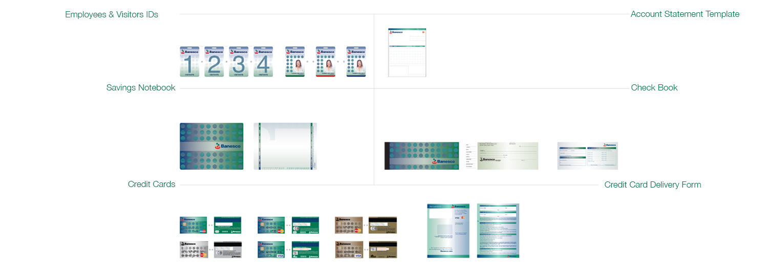
• Development of a strong graphic and visual system for multiple applications from environmental design to financial instruments such as credit and debit cards, checkbooks, etc.
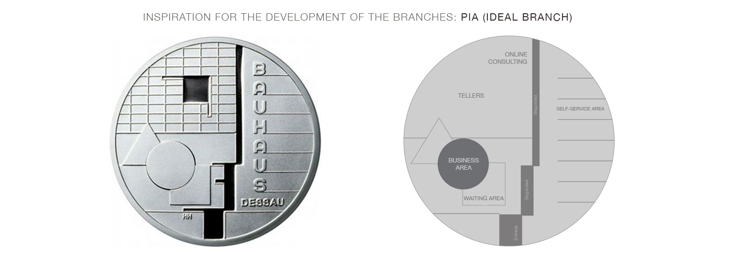
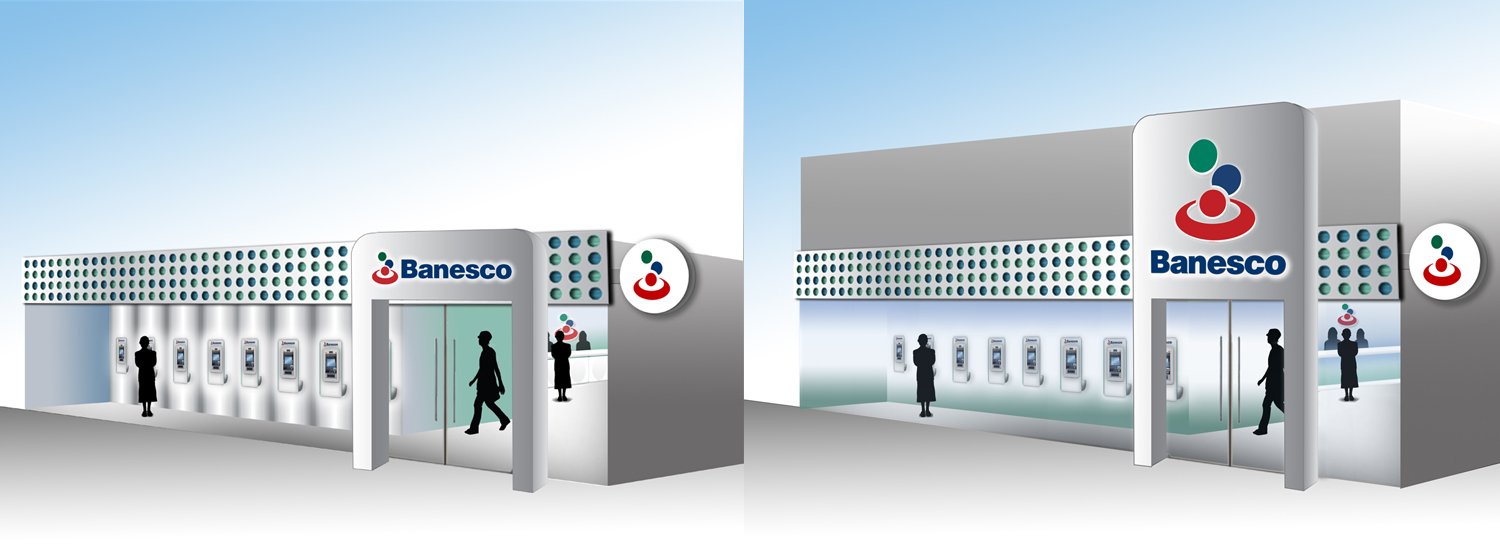
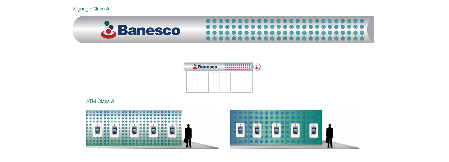
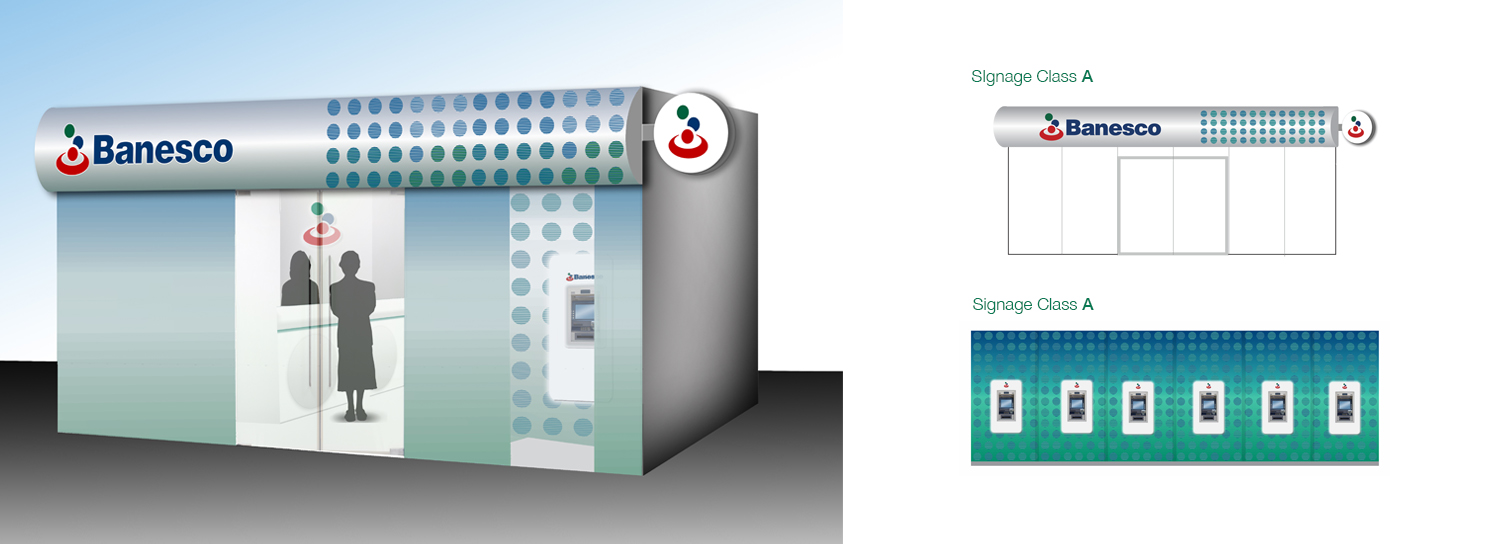
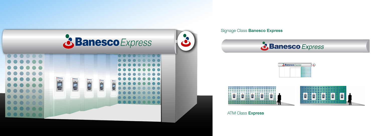
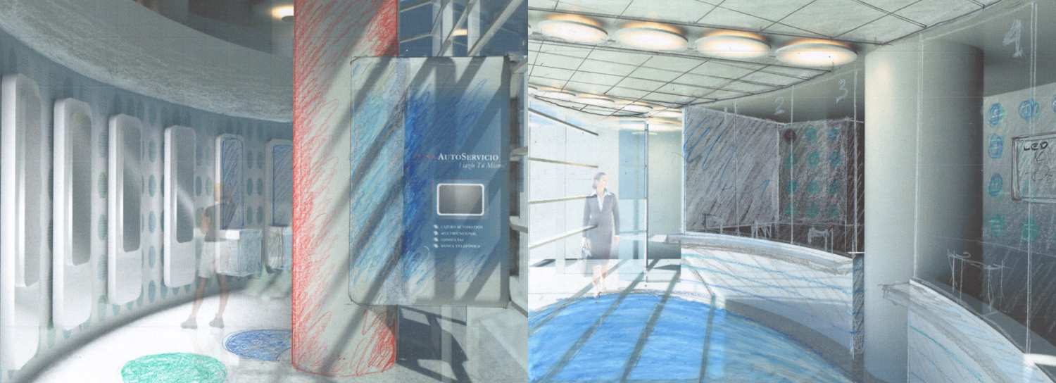
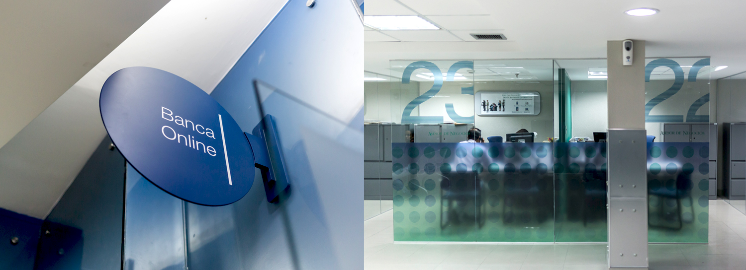
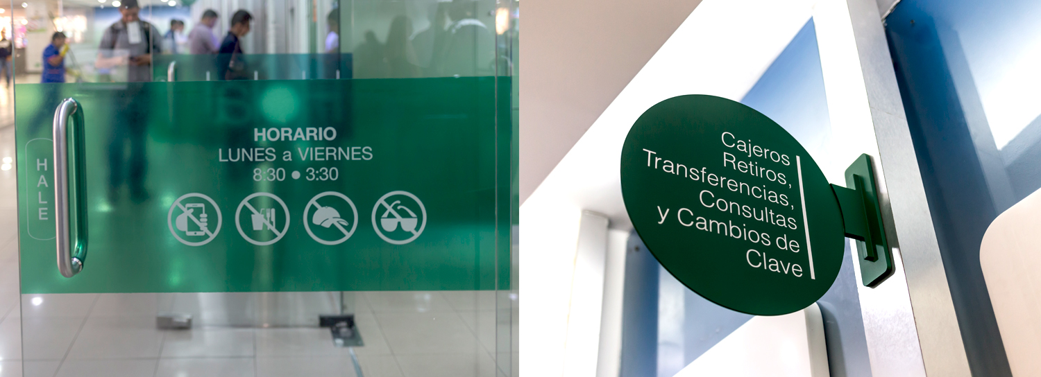
• Using the Bauhaus logo, NDG developed the wireframe for the ideal spatial distribution and layout within the agencies to provide customers and employees a friendlier yet more innovative banking experience.
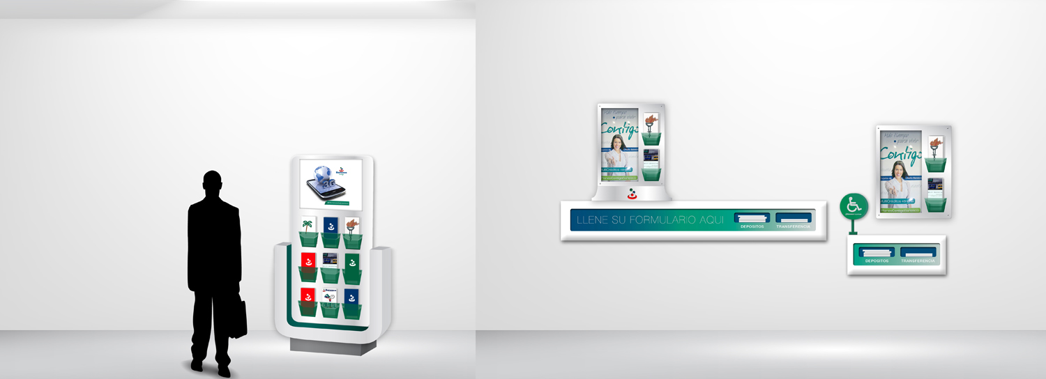
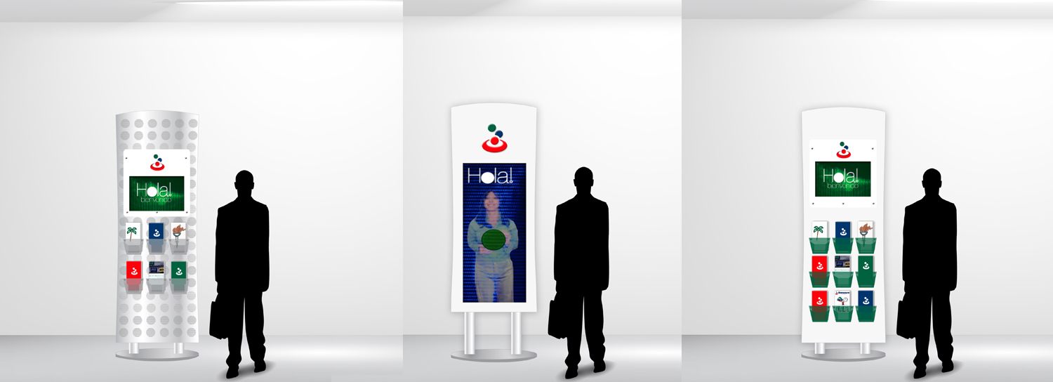
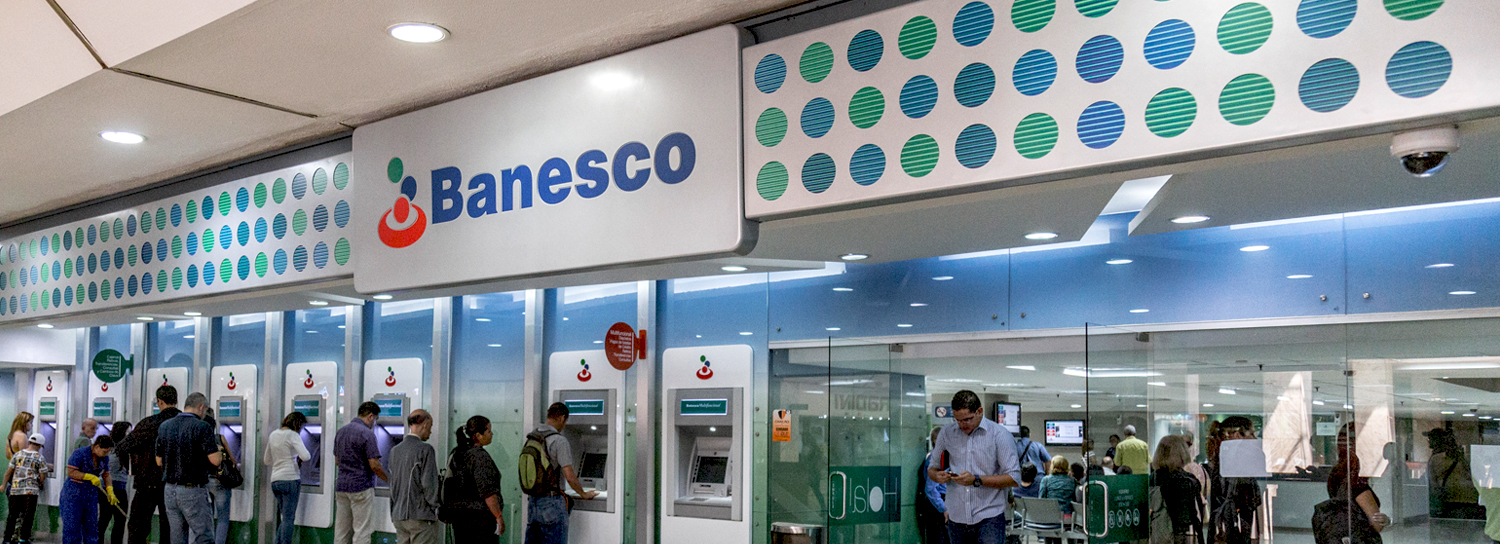
• Education and etiquette became a key ingredient in this new branding chapter. The communications system NDG developed emphasized the importance of client-customer relationships, greetings, and client appreciation. This was achieved by placing Banesco’s signage in the entrance, along with other graphic elements that welcome and salute clients, as well as the training of Banesco’s employees.
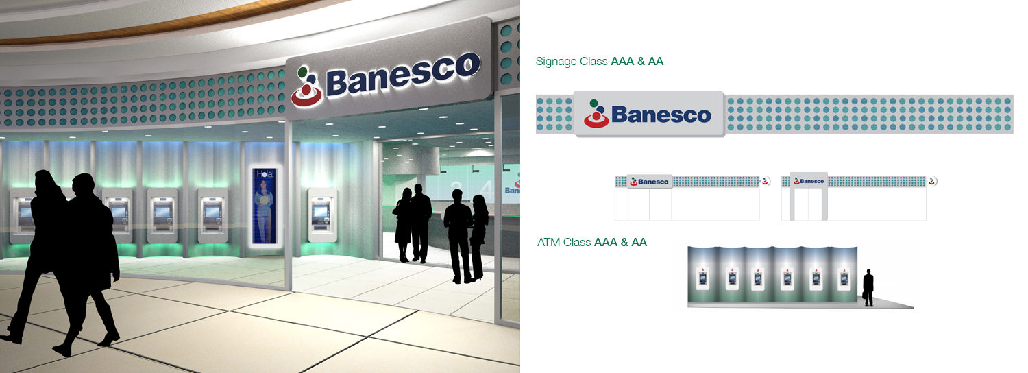
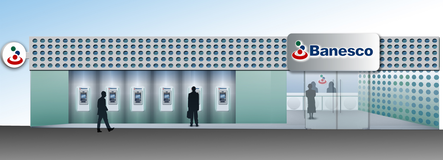
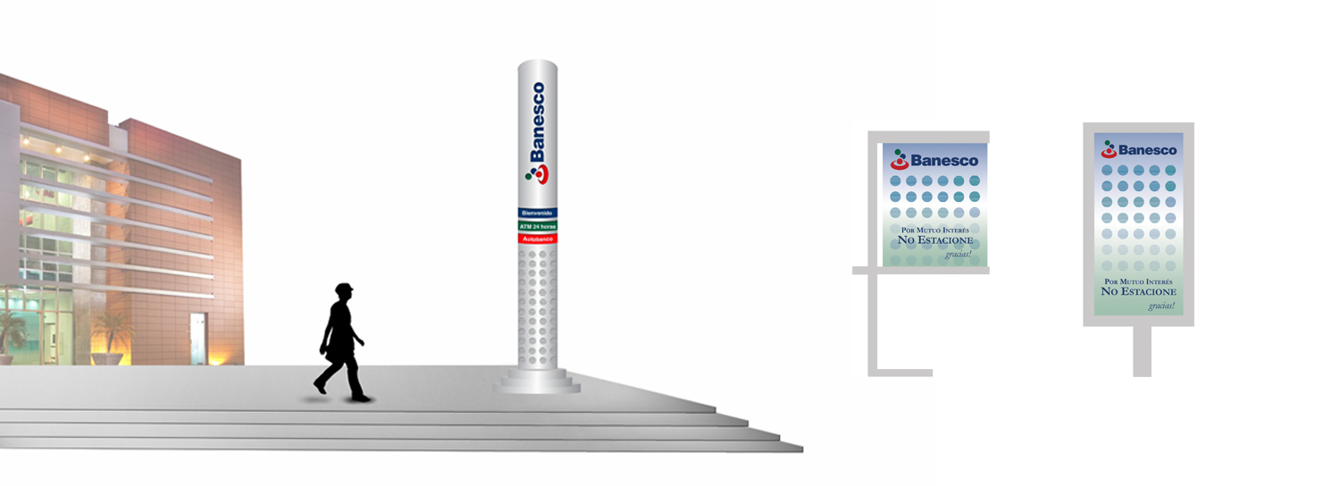
• Creation of a innovative and futuristic look for the entire agency, including the ATMs.
• Incorporated a scent in the agencies, which added to the whole experience of banking with Banesco.
RESULT
NDG recaptured Banesco’s core and differentiating attributes: innovation, technological excellence, solidity, growth, and trustworthiness. Moreover, NDG helped Banesco launch a fully integrated customer experience implementing the new brand strategy successfully within the worldwide branch network and consumer touch points. The objective was to enhance the daily experience of both clients and employees, transforming Banesco’s physical spaces into more productive and enjoyable environments and compel customers to want to return.
Banesco’s branches were redesigned to facilitate the self-service and financial kiosk experience, making it a more pleasant and friendly one for customers. Simultaneously, the strategy was meant to boost customer engagement and loyalty through the reorganization of the advice and sales centers. The application of the graphic and spatial elements created by NDG provided a sophisticated yet warm environment for one-on-one encounters between employees and customers.
The new corporate image created by NDG makes a major contribution to the achievement of Banesco’s global business goals, strengthening client perceptions on an international scale, enhancing and projecting its reputation worldwide, and creating meaningful product and service delivery differentiation from competitors.


