


CHALLENGE
ACF Technologies is a leader in providing consulting and technology related to scheduling, queuing, and managing client interactions. As queuing and scheduling have quickly become commodities ACF has evolved beyond customer flow to provide consultative selling solutions for the entire enterprise Customer Xperience.
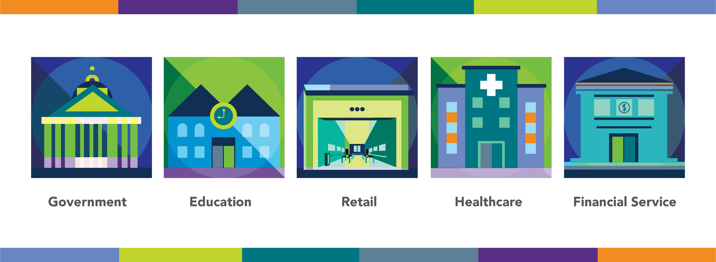
Moreover, currently ACF offers solutions for multiple market verticals (government, education, financial services, and retail) while operating independently from two different headquarters: one for the US and one for Latin America.
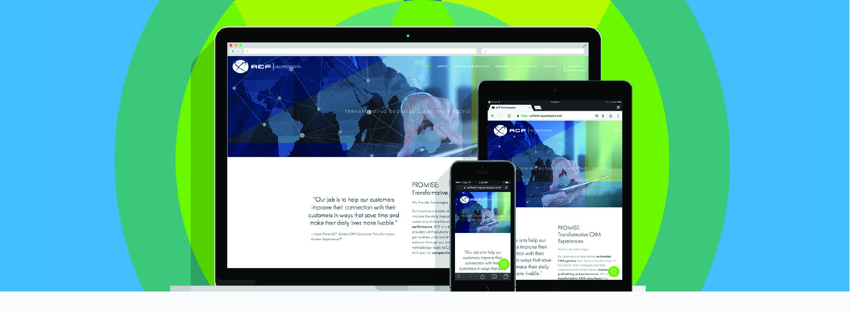
Neri Design Group’s challenge was to create a more unified and singular approach for ACF to their marketplace through an alignment of the branding and messaging of the LATAM and US divisions in addition to creating a more user friendly digital interface for their website. ACF wanted to reflect a more modernized look and feel while simultaneously respecting their historical legacy and success.
INSPIRATION
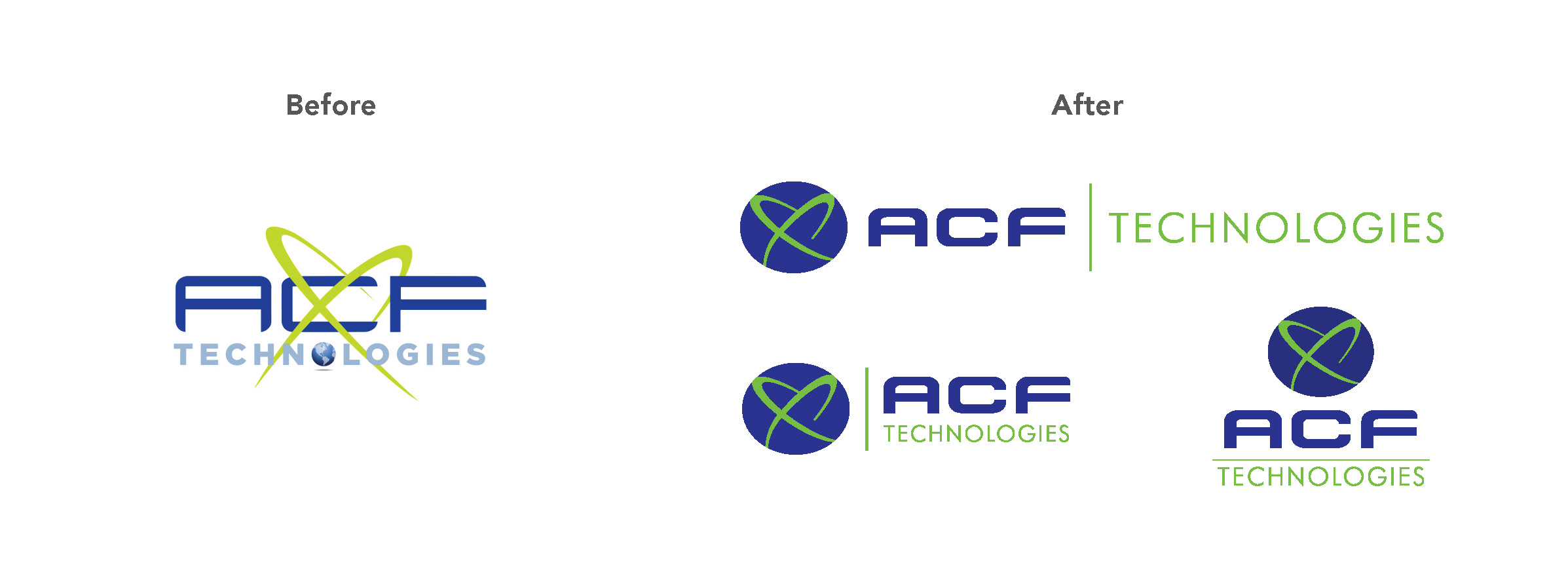
For highly personal reasons ACF was emotionally attached to their original logo, hence any change needed to preserve its core essence. Looking closely at the “X” in ACF’s original logo it reminded NDG of a planetary ring and the energy, luminosity and greatness they provide to the planet which they surround. This “X” was an element that inspired us and would be preserved in the brand’s redesign. The ‘planetary ring’ represents ACF’s Customer Xperience solutions that enlighten and inform each and every customer interaction and organization with whom ACF works.
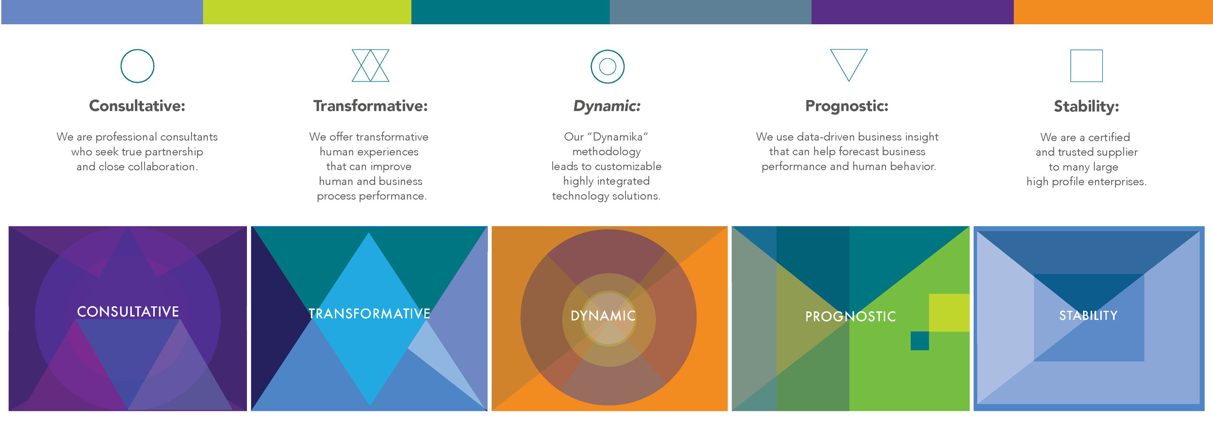
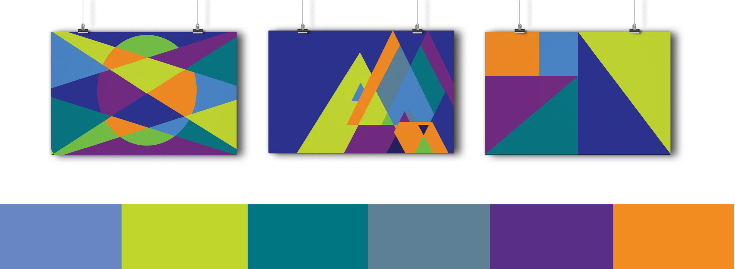
Also, geometrical shapes serve as strong, bold and striking design elements that inspired NDG to redefine ACF’s logo and create design patterns to be used in different communication tools. Each shape has its own meaning completely aligned with ACF’s true distinction. Squares and rectangles represent ACF’s stability, they are familiar and trusted shapes that suggest honesty. The circle is a universal symbol representing wholeness, original perfection as well as ACF’s timelessness. The triangle is connected to the number three, which represents ACF’s true wisdom aligned to their Dynamika consultative services.
SOLUTION
In order for ACF to grow its brand reputation and market its capabilities with a clear, effective, consistent visual and linguistic branding system NDG applied its Brand Weave strategy. Brand Weave is an outstanding design methodology and philosophy that results in a clear and unified brand communication system to help differentiate ACF from its competitors. Through the Brand Weave process NDG determined ACF’s positioning as evidenced by its value proposition, differentiating attributes, target audience and key messages.
After all these aspects were “woven” into the brand story NDG defined the brand strategy and redesigned their brand image. NDG provided ACF with a modern look while preserving its historical integrity and creating a strong, unified, and attractive brand leaving ACF well positioned for their future trajectory.
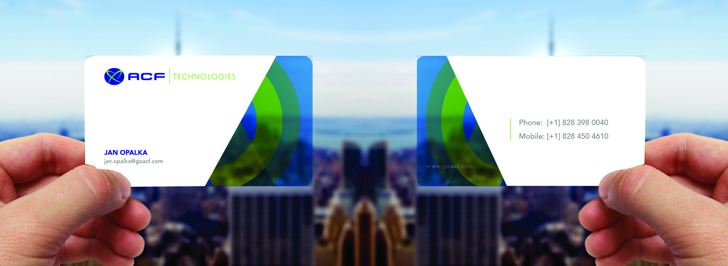
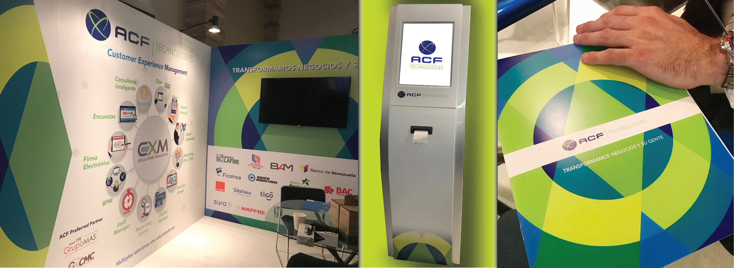
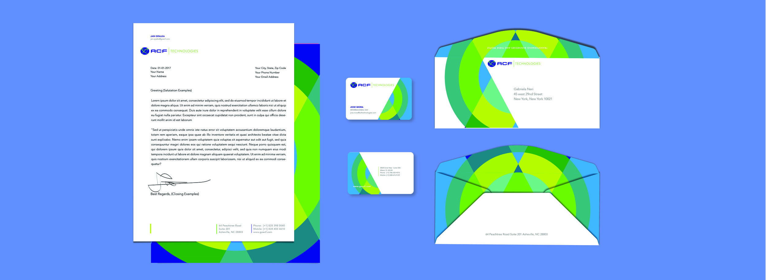
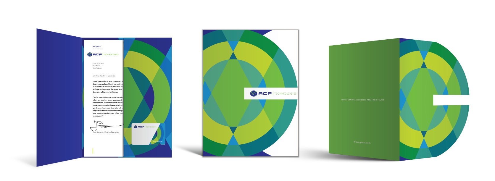
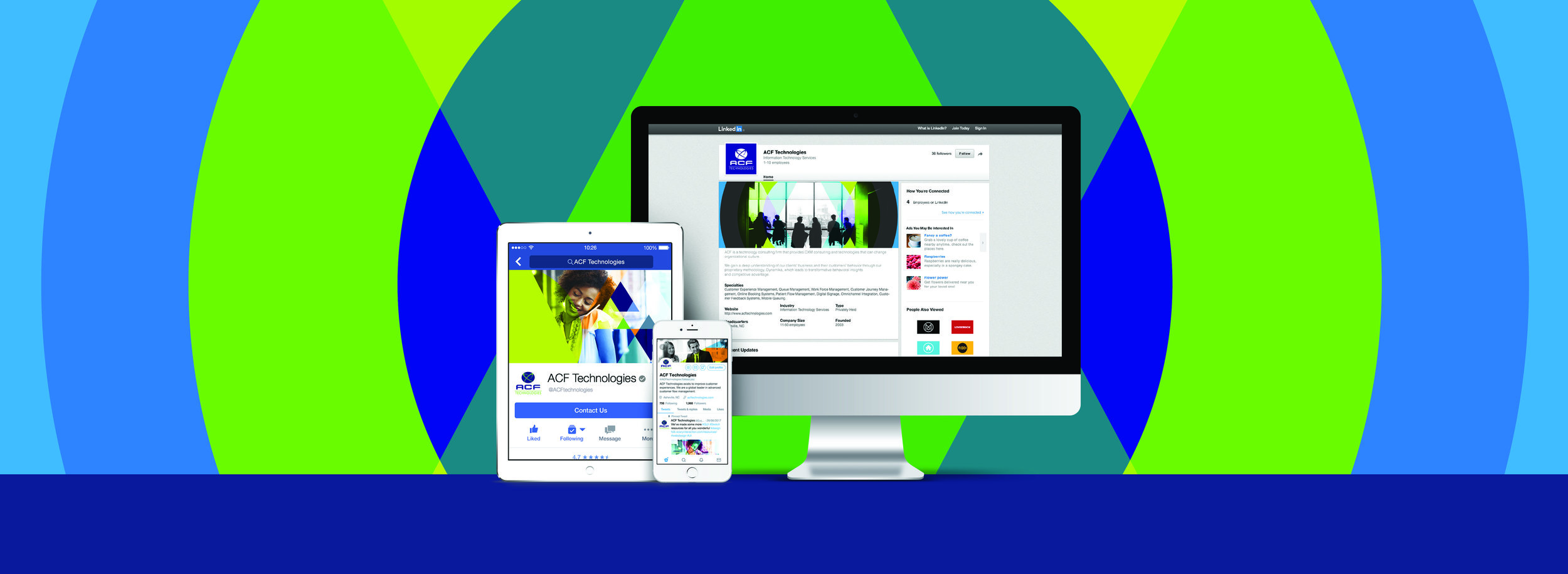
NDG created ACF’s entire corporate brand strategy and image including it’s logo, tagline, stationery system, business cards, imagery for promotional materials, website redesign and social media strategy.
RESULT
Today ACF’s brand effectively and consistently communicates to clients and prospects the company’s distinction, vision, and core strengths. Both LATAM and US markets are completely unified and aligned, prepared to compete with the big players in the enterprise consulting BPM and CX space.
Furthermore, ACF has grown its market share and is now seeking to expand into the healthcare sector. The brand sub-division into different systems allows them to expand and scale their business areas in North and South America efficiently.


