


CHALLENGE
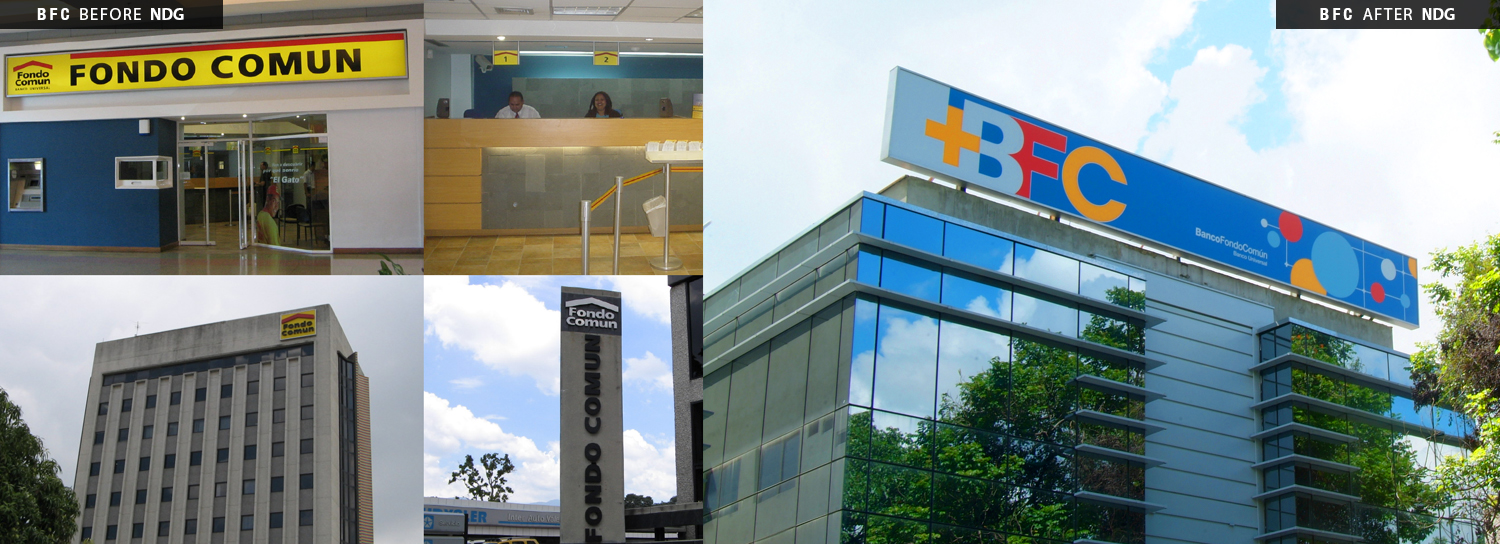
After successful mergers with other financial institutions, in 2009, Banco Fondo Común evolved from providing mainly savings and loans to being a “universal bank” – a full-service, powerful business offering a wide array of products and services to a broad audience – in 2009.
Neri Design Group’s challenge was to create a brand strategy that would attract a younger audience while keeping its current pool of clients, especially pensioners. The goal was to integrate multiple audiences into the communications strategy and give the bank a fresh and friendly image that would help the company grow and expand.
INSPIRATION
Analyzing the origin and significance of the bank’s name, “common fund,” NDG realized that Piet Mondrian’s grids, which use symbols and integrated lines and colors, could be used to promote Banco Fondo Común’s new progressive style while also appealing to members of its client base. Welcoming, structured, and efficient services would become the common ground of the new brand.
SOLUTION
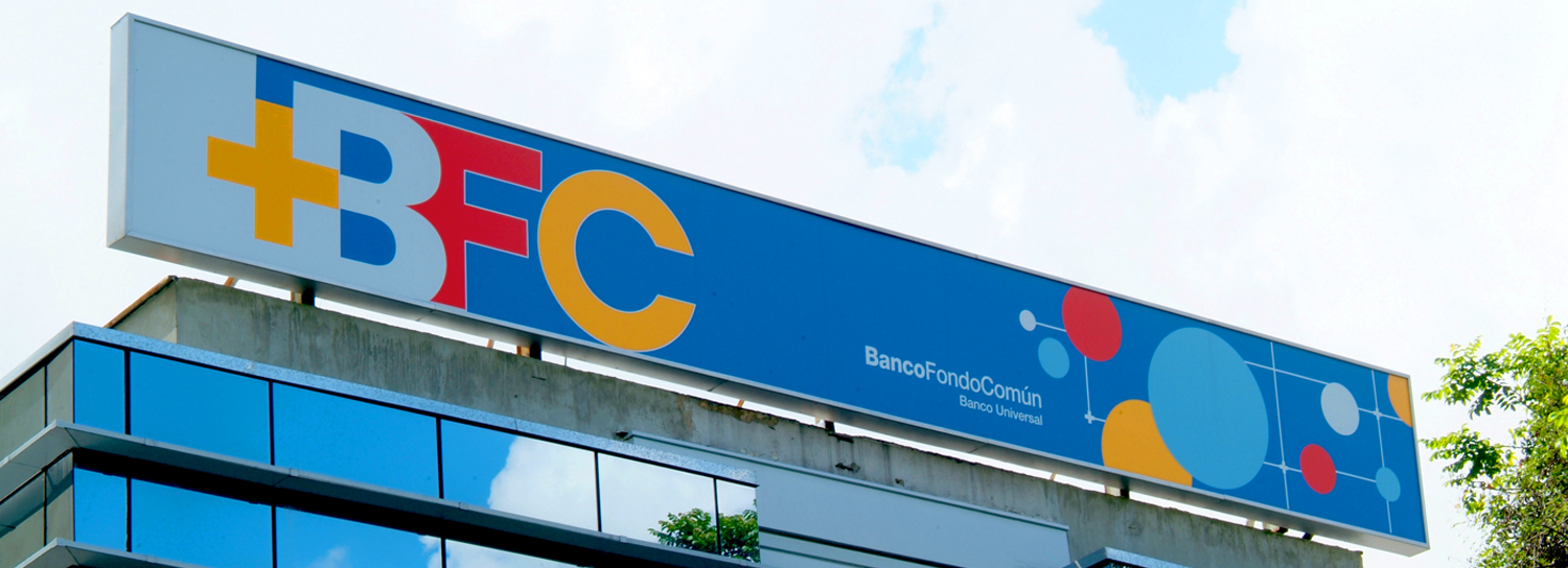
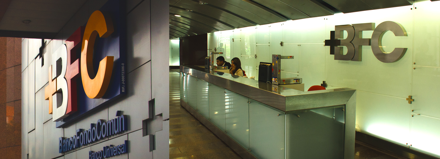
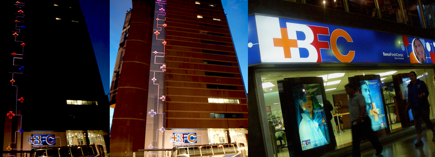
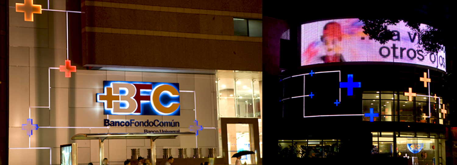
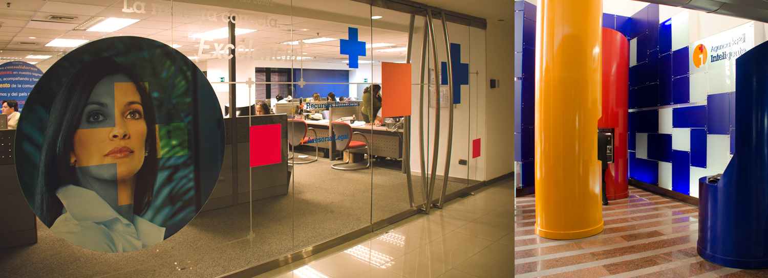
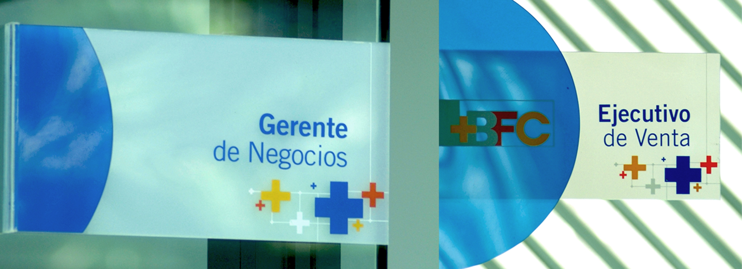
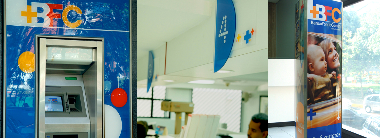
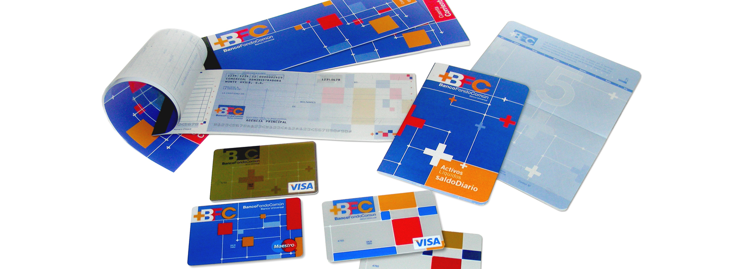
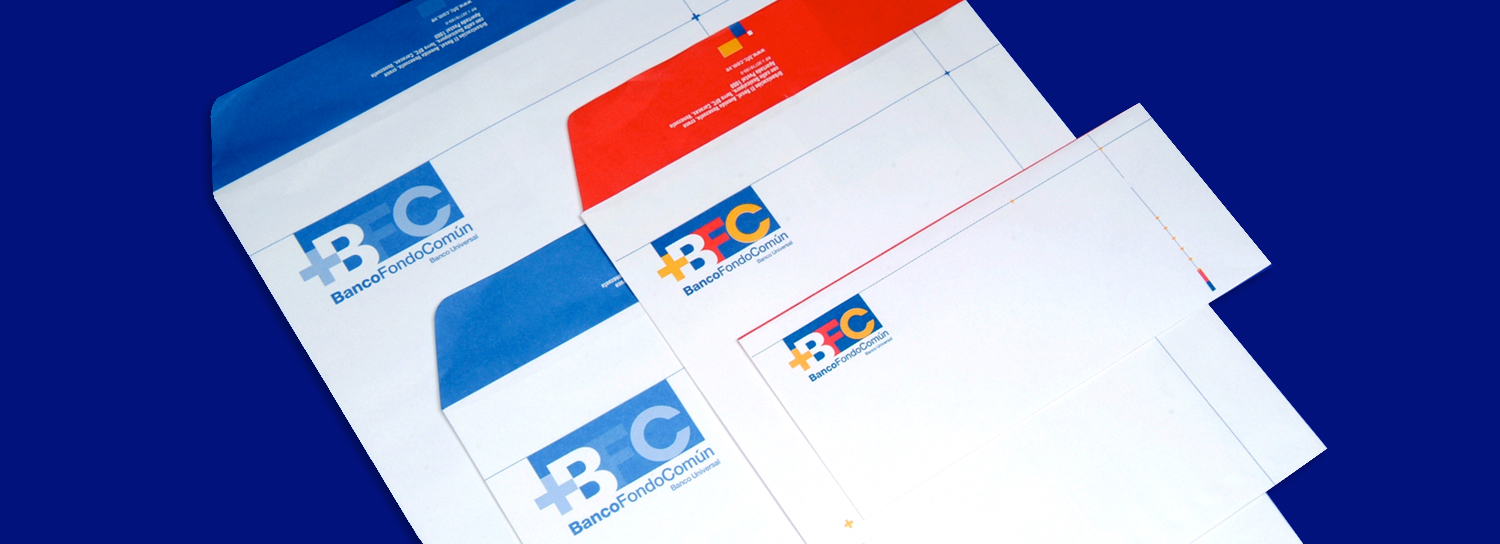
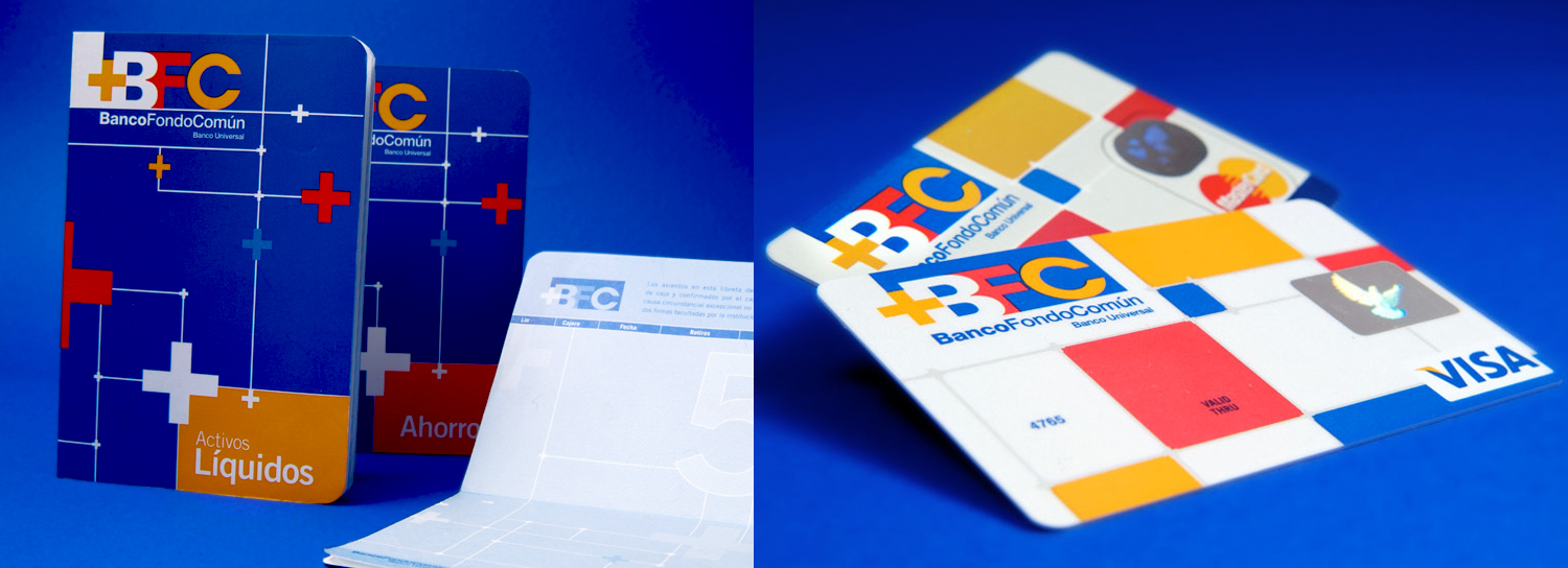
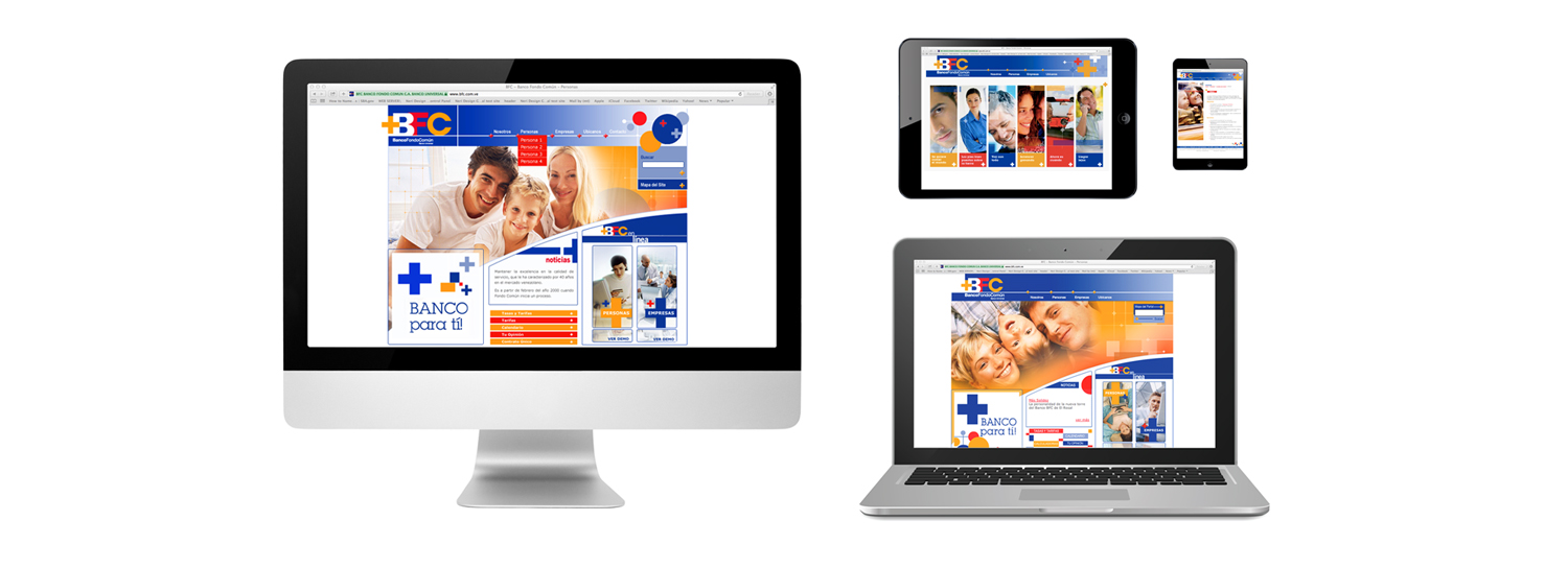
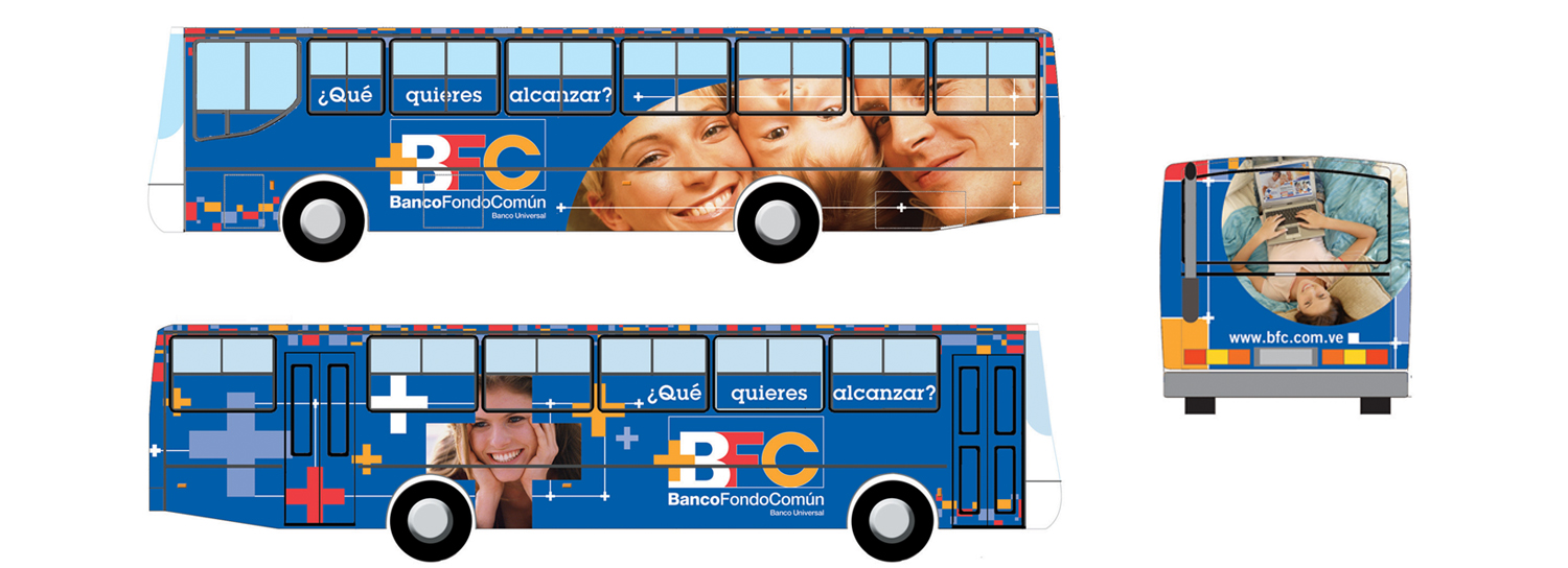
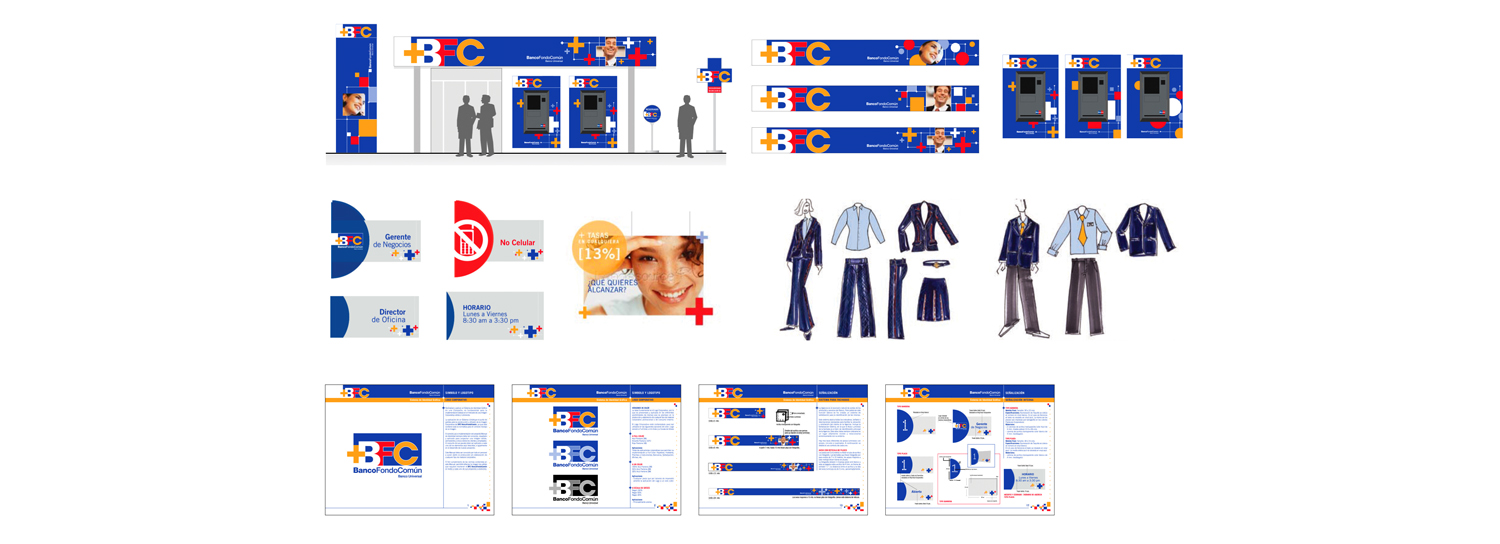
In order to portray a bank that values all customers equally, NDG built a Mondrian style grid that integrated faces and three different shapes: a plus symbol (+), square and circle. This design expresses a union of distinctive and unique audiences. Moreover, the use of primary colors and the combination of lines, faces, and symbols were used to reflect movement and add dynamism to the brand image.
NDG was the first company to apply different graphics and images of people, depending on where the advertisement was located. NDG always took into account the demographic of the area when choosing the appropriate images (if the agency was located in an office building, for example, the pictures would be of businessmen and businesswomen; if it was located in a younger neighborhood, the pictures would be of people in their early 20s; and so on).
NDG also designed the tower that serves as the headquarters of Banco Fondo Común. It has a NASDAQ look and feel and became the equivalent of New York’s Times Square in Caracas. Nineteen floors of the building were completely revamped and given an innovative and modern look.
RESULT
NDG’s work revolutionized the bank’s image nationwide. In the last decade, Banco Fondo Común has achieved exponential growth. The company is now regarded as a leader in producing new ideas and adapting new banking technologies. Its modern corporate image has allowed Banco Fondo Común to attract a new generation of clients


