


CHALLENGE
The bank was 100 years old and seen as solid but stodgy when compared to larger, more aggressive, and technologically-sophisticated competitors. New ownership wanted to reposition the bank to make it an attractive merger target for a larger company seeking to expand its market penetration and become an important player in the industry.
INSPIRATION
Inspired by what is now considered “modern architecture” (clean direct lines and straight to the point), Neri Design Group focused on giving the bank a contemporary look while preserving its heritage, creating a strong brand prepared for the 21st century.
SOLUTION
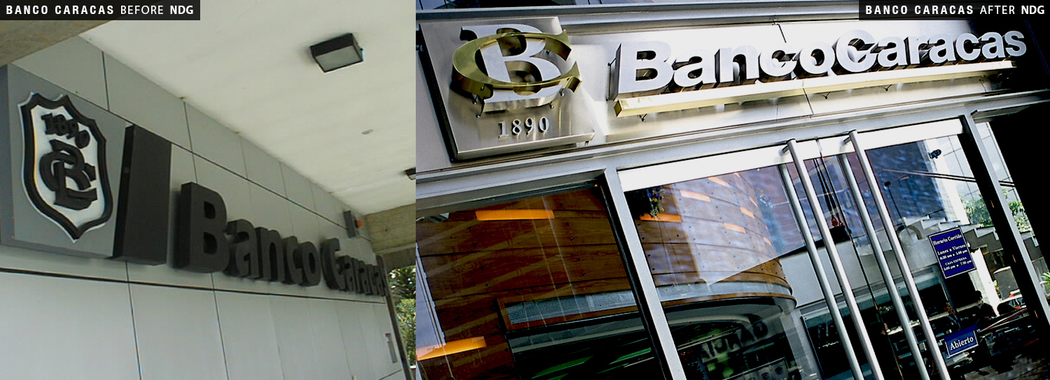
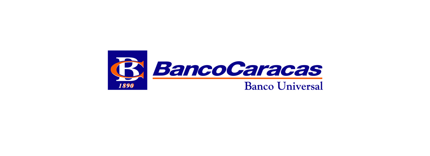
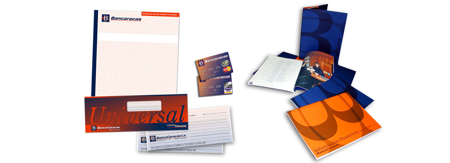
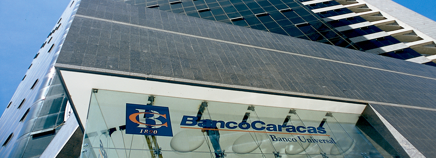
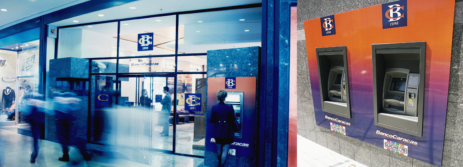
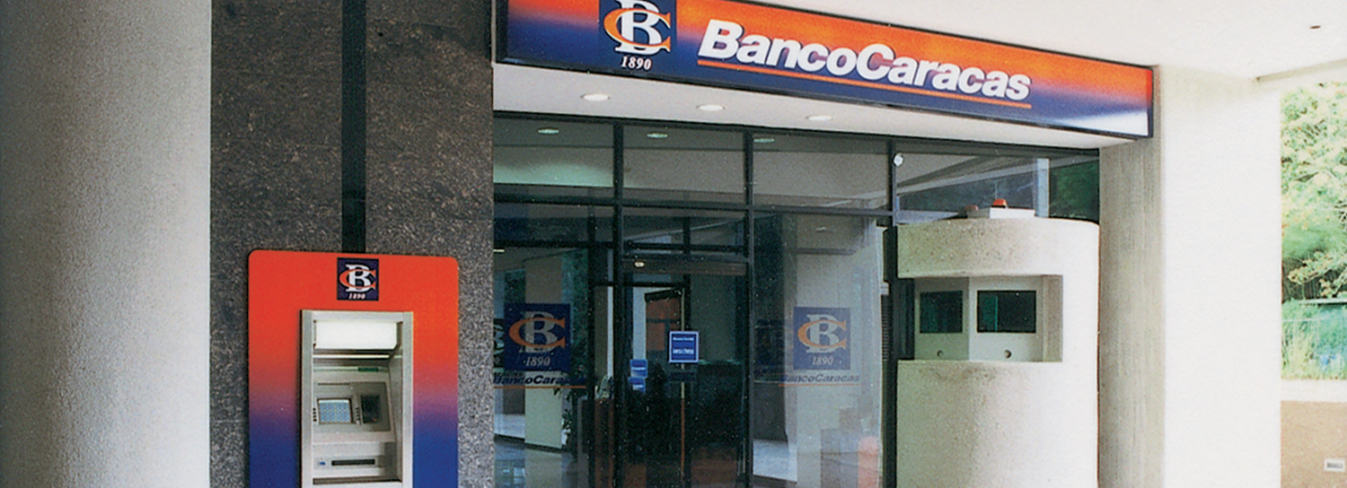
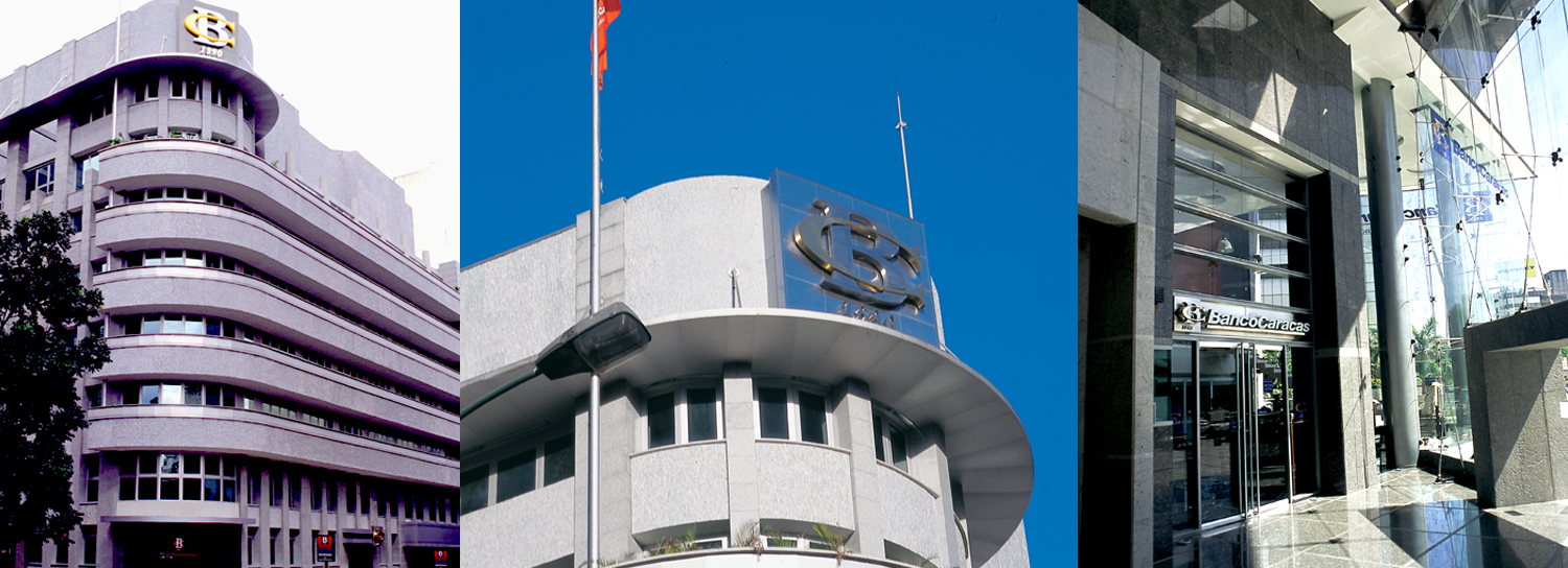
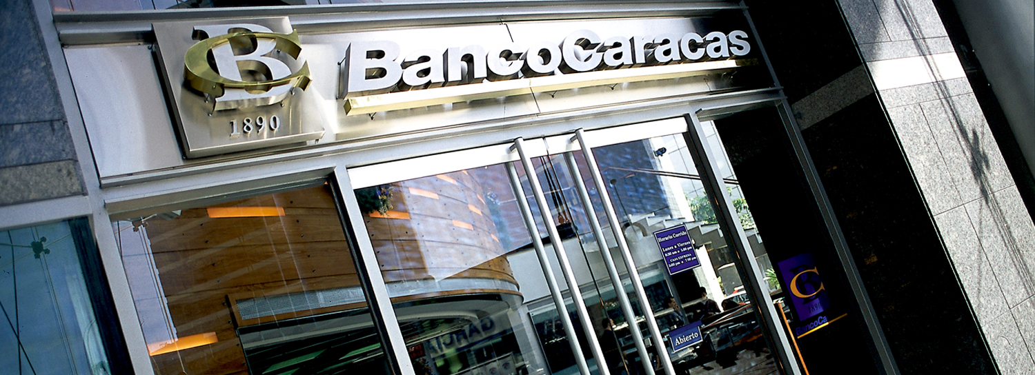
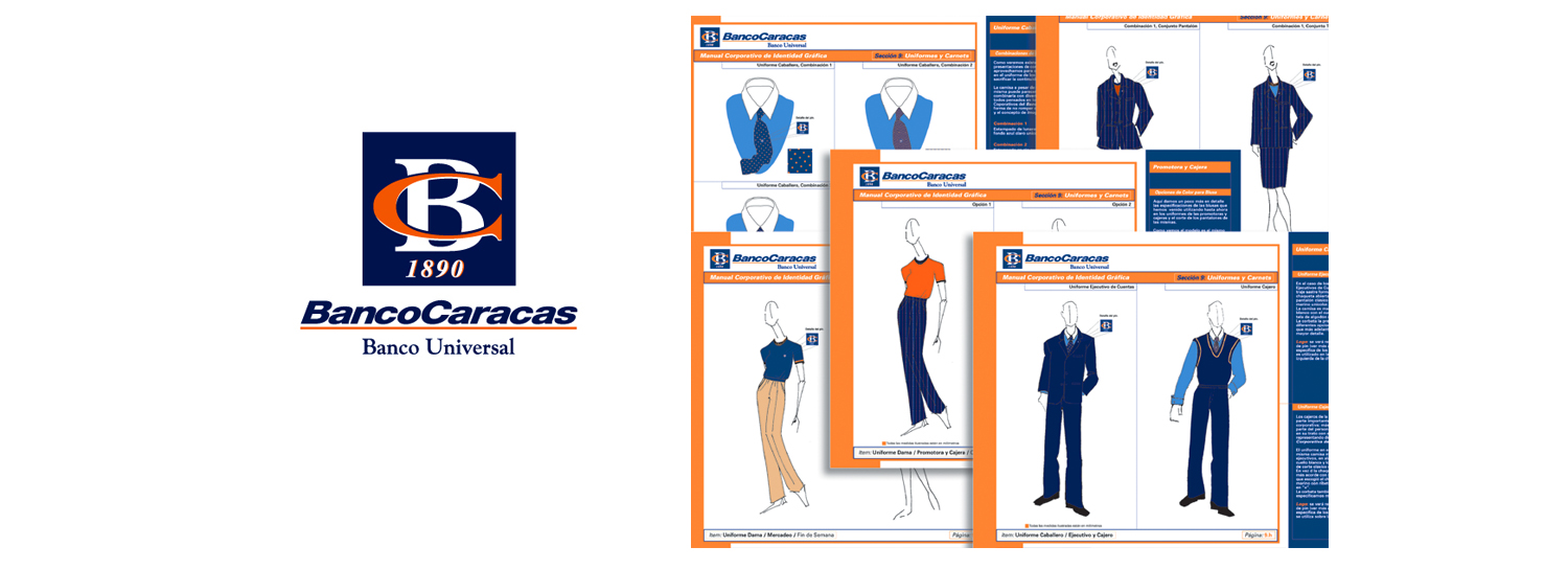
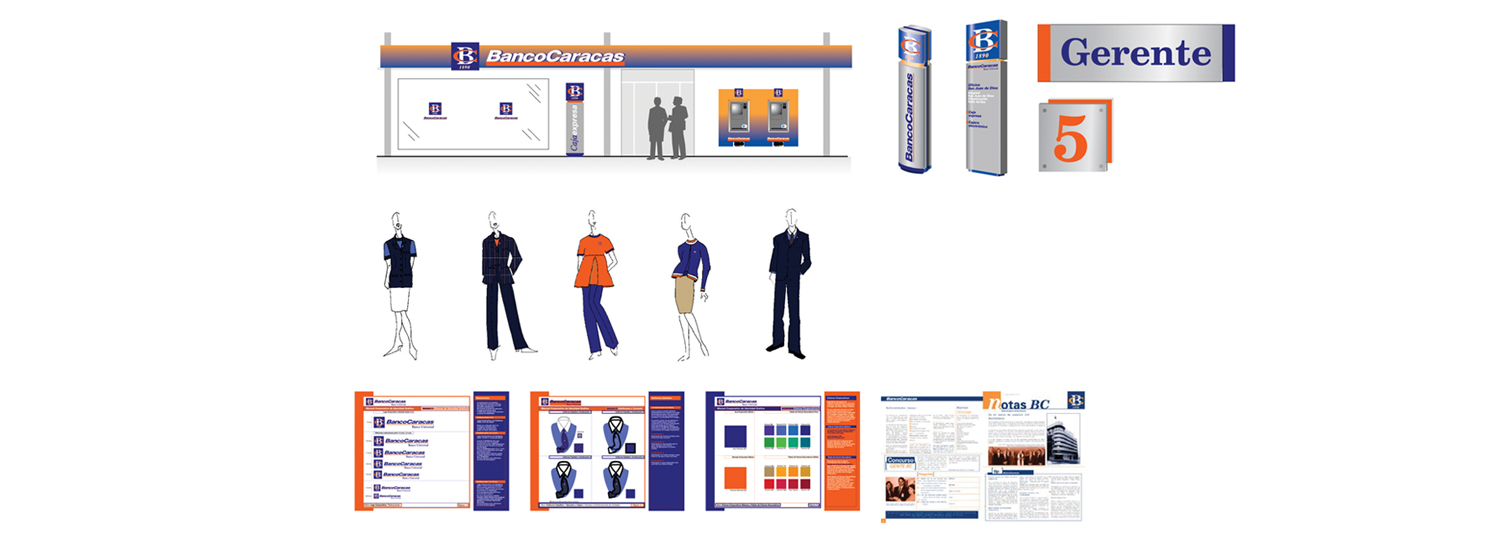
Market research showed that the Banco Caracas name and 100 years of experience gave off a strong, positive first impression. NDG kept the company’s acronym but added a new twist, creating a bold, new emblem incorporating the company’s founding year and the bank’s initials, "BC." This seal was incorporated throughout all bank communications as well as in the headquarters of the company, a building that was renovated to remind visitors of the company’s golden era in the 1950s but that also provided a bridge into the new century by incorporating new trends and technological innovations. NDG also prepared a design manual that provided guidelines for using the new emblem.
Finally, the bank’s colors, brown and orange, seemed old-fashioned and typical of the period when the company started. NDG kept orange in the design, since it symbolizes abundance and also represented the bank’s origins, but paired it with a deep blue to characterize banking and technology. It represented a powerful combination of the old and new and was a distinctive way to reposition the bank.
RESULT
Market research showed that the rebranding of the seal began shifting the bank’s image toward being modern, progressive, and dynamic while maintaining the strength of the company’s heritage. In a year and half, the bank went from being #28 to among the top ten banks of Venezuela. It was subsequently purchased by a large, multinational Spanish banking organization, Grupo Santander, at a significant premium compared to its share price at the time and became one of the most profitable business related.


